Quantcast
Channel: Indicators – System Trader Success
Viewing all 40 articles
Browse latest View live

Stochastic Oscillator (SO) – Test Results

$
0
0

The Stochastic Oscillator (SO) is a widely used momentum indicator. As part of the Technical Indicator Fight for Supremacy we have put it to the test through 16 different global markets~ (a total of 300 years data) to find out how well it works and what settings produce the best returns.

First of all let’s establish how the market performs while the Stochastic Oscillator is in each 10th of its range:

stochastic-oscillator-range-10

I have highlighted each of the negative results across a Red—>Orange gradient and positive results across a Light Green—>Dark Green gradient (depending on how great the loss or gain).  Clearly most of the market gains occurred while the Stochastic Oscillator was above 50 and the lion’s share when it was above 90.

What this means is that when the market is in the top 50% of its range it has a tendency to go up and when it is in the top 90% of its range it has a strong tendency to go up.  It also tells us that we want to avoid being long when the market is in the bottom 50% of its range.  Over what period do we base this range?  Interestingly, the returns do not change much over the different lookback periods although the benefit of a longer look back is less volatility from the signals.

Let’s now look at segments of 20-50% when the Stochastic Oscillator is above 50:

stochastic-oscillator-range

The table above is colour coded Red—>Yellow—>Green from Lowest—>Middle—>Highest return.

The message coming through loud and clear is that you need to be long when the market is making new highs if you want to make money.  Over a 255 day lookback (about 1 year) the difference between going long in the 50-90 range vs the 50-100 range is the difference between making 2.68% or 8.38% a year!!

Let’s have a look at the trade profile:

252-day-so-eow-50-100-l-any

The results above show what would have happened if a long position was opened and held any time, any of the 16 test markets had a reading above 50 on their Stochastic Oscillator (meaning that the market was in the top half of its range).  We chose a period of 252 days, not because the returns were the best, but because this look back produced a longer average trade duration and 252 days is the average number of trading days in a year.

The returns are not as good as we have seen from other indicators such as the RSI or the Moving Average Crossover but they are still respectable.  Furthermore, an average trade duration of 104 days is advantageous when looking for a long term indication of market direction.

What about the %K signal line?  We did test this but the results were not worth taking the time to publish.  They are included in the results spreadsheet for free download if you wish to review them however.

Stochastic Oscillator Conclusion

The Stochastic Oscillator %K line is too volatile and is not worth considering in your trading as originally suggested by Dr. George Lane in the 50′s.  There are better options for short term trading such as the FRAMA.  In fact, there are also better options available for longer-term indications of market direction than the Stochastic Oscillator as presented in this article… So is it worth bothering with at all?

Well… YES and here is why:

The fact illustrated by these tests is that the majority of gains occur when the market is in the top 10% of its range and nearly all of the gains occur when the market is within the top half of its range. There has been a lot of research published on momentum strategies and they typically involve buying the best performing assets out of a selection and then rotating funds periodically so as to constantly stay with the best.  Many people fear holding markets that are near their highs so by rotating constantly into the current market leaders these fears are alleviated.

What our tests on the Stochastic Oscillator reveal however is that simply holding an index fund when it is in the top half of its range (over almost any lookback period) will capture the majority of the gains while STILL avoiding those much feared ‘bubble burst’ like declines.  Contrary to popular belief; when a market bubble bursts it does not do so overnight.  Penny stocks my grow exponentially and then plummet the next day.  On rare occasions large companies may even do so.  But major economies cannot turn on a dime.

Therefore, the Stochastic Oscillator could be a useful addition to a momentum rotation type strategy.  Another idea worth considering is to change the rules for your trading system based on the Stochastic Oscillator reading.  For instance, we know that most gains occur when the market is making new highs, therefore the rules for taking profits on a long position should be different when the Stochastic Oscillator  is above 90 than they are when it is between 50 and 60.

Both of these applications will be included in future tests.

More in this series:

We have conducted and continue to conduct extensive tests on a variety of technical indicators.  See how they perform and which reveal themselves as the best in the Technical Indicator Fight for Supremacy.

  • The data used for these tests is included in the results spreadsheet and more details about our methodology can be found here.
  • No interest was earned while in cash and no allowance has been made for transaction costs or slippage.  Trades were tested using End Of Day (EOD) signals on Daily data.

The post Stochastic Oscillator (SO) – Test Results appeared first on System Trader Success.


Best Stock Market Indicator Ever: Rises to 85%; Secondaries Are Negative

$
0
0

The $OEXA200R (the percentage of S&P 100 stocks above their 200 DMA) is a technical indicator available on StockCharts.com used to find the “sweet spot” time period in the market when you have the best chance of making money.

The weekly charts below are current through the week’s close.

Important Notice:

As of June 17, the criteria for the OEXA system have been modified to get a more accurate indication of market conditions. The new methods are detailed in the section below entitled “Background on How I Use This Indicator“. Note that I have also switched from monthly to weekly OEXA200R and S&P charts for increased precision.

 Weekly OEXA200R vs. S&P Comparison
John-Carlucci-Update-Fig-1
John-Carlucci-Update-Fig-2

According to the new criteria explained in the section “Background on How I Use This Indicator“, green vertical lines indicate market entry points, red indicate exit points.

Interpretation:

According to this system, the market is now Un-tradable. The signal for an exit came on June 10 when two of the secondary indicators turned negative.

The OEXA200R closed Friday at 85%, up four percent from last Friday’s close.

Of the three secondary indicators:

  • RSI is NEGATIVE (below 50).
  • MACD is NEGATIVE (black line below red).
  • Slow STO is NEGATIVE (red line above black).

Commentary

A thought experiment…

Just about everyone expects a short term correction at this point, but what about the long term? We might get some idea by looking at where the market is today in relation to its long term trend. As you can see in the chart below, the S&P is 65% above the 140 year mean. For it to revert just to the mean would require a drop to approximately 1000. However, when any system is thrown out of balance it first compensates in the opposite direction before settling back to equilibrium. This means that we could see a far greater drop as the S&P falls from its high in 2000.

John-Carlucci-Regression-Study

It is interesting to note that on this logarithmic chart the slopes from the three previous highs to lows are all exactly 34 degrees. Since the slope lines could have fallen anywhere between horizontal (45 degrees) and vertical (180 degrees) along a 45 degree arc, the odds of all three just happening to be exactly 34 degrees are 91,125 to one. One of my readers kindly pointed out that 34 is also a Fibonacci sequence number, something I was completely unaware of. If this is all just a coincidence, it’s a very unlikely and curious one. If anyone with a mathematical background has any ideas, please share them with us!

Dropping a 34 degree slope line from the 2000 peak indicates that the S&P is above the mean for the current secular bear as well as the 140 year trend. In other words, it’s doubly “top heavy”. As the market counter-balances from the 2000 high a couple of possibilities arise. If it drops to the level of previous moderate bottoms represented by the green line we see the secular bear ending at S&P 500 in 2023 (green arrow). If it drops to the level of the all time 1932 low represented by the blue line we see S&P at 400 in 2026. Remember that the S&P crashed to “just” 666 in 2009. Since the 2000 high was the all time extreme variance from the trend at 153% it is not unreasonable to imagine an extreme over-compensation to the 400 estimate, as unpleasant as that would be. These scenarios seem much more likely than the S&P gently landing on and following the mean line, let alone suddenly making a u-turn and taking off into a multi-year bull. They also mesh with demographic trends that Doug Short has previously examined. Not that past is always precedent, but we could be in for a long slog.

Background on How I Use This Indicator

The OEXA200R is a valuable metric used to accurately assess the state of the market in order to make profitable trading decisions. That is, whether we are in a bull, a bear or transitioning from one to the other, as well as market volatility and risk within each of those situations. Historically, it has also given traders a clear early warning signal of impending serious market downturns and later safe re-entry points. While not intended as a day trading tool per se it can certainly be used as background information by day or highly speculative traders. Simply put, the OEXA200R gives traders the ability to identify the most opportune conditions within which to execute their various long, short or hold strategies.

Definition of Terms:

Tradable” refers to the point at which it is most advantageous to enter and continue long trading.

Un-tradable” refers to the point at which it is advisable to exit all long positions that have not already automatically closed with a trailing stop loss. Please be aware that the OEXA exit points are not always timed at the exact top of any run up, that is impossible to predict. However, a trailing stop will follow the price to the highest point and close out as it falls from there, meaning most positions should have closed before the OEXA exit signal appears and thus should close at a point higher than at the exit signal.

Following a major market correction, the conditions for safe re-entry are when:

a) Daily $OEXA200R rises above 65% (I follow the Daily but do not publish the chart here)

And two of the following three also occur:

b) Weekly RSI rises over 50
c) Weekly MACD black line rises above red line
d) Weekly Slow STO black line rises above red line

Without the solid foundational support of two out of three Weekly secondary indicators it is unsafe to trade even if Daily OEXA200R edges above the 65% line. The market is considered safely tradable as long as Daily OEXA200R remains above 65% and two Weekly secondary indicators remain positive. Volatility and risk for long traders are relatively low. The trend is on their side.

Conversely, when Daily OEXA200R drops to 65% and / or two out of three Weekly secondary indicators turn negative it is taken as the conservative signal to exit all long positions, even if Daily OEXA is above 65%, as is the case now (June 24, 2013). Volatility and risk increase substantially. In the past, this has often been a “tipping point” condition presaging a substantial market drop.

It might sound confusing but just look for the notice in the “Interpretation” section above as to whether the market is simply either “Tradable” or “Un-tradable”. In the future, when either of these entry or exit conditions occurs I will do a flash update the same day posted on Advisor Perspectives.

If the OEXA200R does not rebound but remains below 65%, how to proceed depends on the overall trend of the market. During the cyclical bull of 2003 to 2007, the market was still safely tradable with OEXA200R in the 50% to 65% zone because there was enough upwelling lift in the S&P at that time to minimize the chance of a sharp, significant market downturn.

The problem is that we can by no means confidently compare our present situation to that of 2003 – 2007. There is no strong, steady wind pointing the market weathervane in one direction, it is being buffeted by swirls and gusts in unpredictable ways. To better understand this, take a look at the charts below, in particular the overall trend of the OEXA200R during the 2003 – 2007 cyclical bull compared to the trend from 2007 to present.

John-Carlucci-Update-Fig-3
John-Carlucci-Update-Fig-4

S&P chart indicates that for the past five years we have not had a steady upwelling trend in the market comparable to 2003 – 2007. Absent that underlying support, the OEXA200R has undergone significant gyrations since 2007. This erratic behavior has only been exacerbated by the Fed’s deliberate manipulation which has distorted normal organic market price movement. Notice also that even in spite of the Fed-fueled rally, the S&P volume has experienced a steady decline since 2009, a Bear indicator of “main street” investors taking flight.

If the OEXA200R drops below the 50% line we regain clarity as to the market’s direction. That will be the strong signal of a serious, imminent market decline. It will also be the clear signal for short traders to take advantage of that sharp decline.

Long Term Performance of the OEXA System

For a hypothetical “trade” of the S&P 500 Index, a single Buy and Hold entered on July 13, 2009 and exiting on June 10, 2013 would have generated a 72.98% total return with an 18.24% average gain per year. The OEXA system would have produced an 82.96% total return with a 20.74% average gain per year after 8 compounded trades.

A single Buy and Hold trade entered on April 28, 2003 and exiting on October 15, 2007 would have generated a 61.29% total return with a 13.62% average gain per year. The OEXA system would have produced a 40.65% total return with a 9.04% average gain per year after 8 compounded trades.

By regularly exiting in an advantageous manner at market tops OEXA avoids the equity destruction suffered by Buy and Hold investors in downturns, especially during severe drops. After their 2007 exit OEXA traders would have been able to resume in 2009 with their accounts fully intact, unlike many other unfortunate souls. You might think that having a clear exit strategy for a downturn is plain common sense but the $6.9 trillion loss investors suffered in the 2008 crash says otherwise.

By exiting at opportune points and engaging in multiple compounded trades, from April 28, 2003 to June 10, 2013 OEXA returned 259.99% (26% avg. per year over 10 years) vs. Buy and Hold 74.84% (7.48% avg. per year over 10 years). Of course, these raw numbers are affected by capital gains tax, dividends, inflation, etc. but the concept remains the same.

–By John F. Carlucci

John is a formerly retired first wave boomer with a Ph.D. in English from Duke and a lifelong interest in economics and finance. In 2011 his website was acquired by Advisor Perspectives, where he serves as the Vice President of Research. Read more at John’s website.

July 15, 2013 Update:

This article was originally written several weeks ago. As a result, the indicators have turned positive over the past week. In short, we are right on the cusp between bull and bear and it will be worth keeping an eye on.

The post Best Stock Market Indicator Ever: Rises to 85%; Secondaries Are Negative appeared first on System Trader Success.

Moving Averages – Simple vs. Exponential

$
0
0

In this round of testing we put the Simple (SMA), Exponential (EMA) and Double Exponential (D-EMA) Moving Averages through their paces to identify which is the best and what characteristics can be expected as the length of each average is adjusted.

We tested Long and Short trades using Daily and Weekly data, taking End Of Day (EOD) and End Of Week (EOW) signals with Moving Average lengths varying from from 5 – 300 days or 60 weeks.~ These tests were carried out over a total of 300 years of data across 16 different global indexes (details here).

Simple vs. Exponential – Test Results:

Simple vs. Exponential Conclusion

 Download A FREE Spreadsheet With All 948 Long and Short Test Results

moving-average-l-an-s-ann-r2


Above you can see how the annualized return changes with the length of each Daily, EOD Moving Average for the Long and the Short side of the market.  The relative performance of each MA is similar when going Long and Short but the returns on the Short side were much lower.

Both the SMA and EMAs spiked in return at 25 days and then returns steadily declined as the length of the averages increased, although the SMA did see some improved performance between 190 and 250 days.  The D-EMA on the other hand is much faster and returns steadily improved as the Moving Average length increased from 20 through to 300 Days.  (See Tests on the Triple Exponential Moving Average and D-EMA over longer periods – HERE.)

I was surprised to see that every single Daily, EOD Moving Average on the Long side outperformed the buy and hold annualized return of 6.32%^ during the test period (before allowing for transaction costs and slippage).  On the Short side however, not a single average was able to beat the market during the test period.  5 – 75 Days appears to be the most effective zone, with the EMA proving to be superior to the SMA and D-EMA by annualized return.


moving-average-l-an-s-ann-r2


Above you can see the performance of each average during only the times that it actually had an open position.  For the SMA and EMA the annualized return during exposure decreases as the length of the moving average is increased while the D-EMA exhibits the opposite behavior right up to the longest period we tested of 300 days.  The 5 – 75 Day zone and the EMA also produce the best results by annualized return during exposure.


moving-average-l-an-s-t-d1


As would be expected, with an increase in the length of a moving average comes an increase in the duration of the trades that are generated.  For all three classes of Moving Average tested, the duration of trades on the Short side was far less than those on the Long side.   This is likely to be a function of two things – 1.  The fact that the global markets gained an average of 6.32%^ annually during the test period, 2.  Bull markets tend to be personified by slow and steady gains and bear markets tend to be faster and more violent.

From the above chart you also get an idea of just how much faster a D-EMA is.  Notice how on the Long side, the average duration for a 300 Day, EOD D-EMA is similar to that of a 110 Day, EOD EMA or a 85 Day, EOD SMA.


moving-average-l-an-s-time


Exposure to the market increases on the Long side and decreases on the Short side as the length of a moving average is increased.  However the amount of exposure provided by the D-EMA levels off with each average above 140 Days long.


moving-average-l-an-s-big-l


There is no clear correlation between size of the largest single losing trade and the length of a moving average.  However the D-EMA consistently suffers larger loses than the SMA and EMA on the Long side but after 90 Days tends to suffer smaller loses on the Short side.


moving-average-l-an-s-prob1


Across the board, the probability of profit decreases as the length of an average increases but the D-EMA clearly identifies profitable trades more consistently than the SMA or EMA on both the Long and the Short side of the market.

Daily vs Weekly Data – EOD vs EOW Signals

Due to the superior performance of the EMA in the previous tests, lets take a closer look at how it behaves with Daily and Weekly data, taking EOD and EOW signals to see which combination is the most effective:

ema-ann-return-long1


As you can see, there is a big difference between using EOD and EOW signals on the shorter averages but the results from Daily and Weekly data are very similar (Note – Each Daily average is compared to its Weekly equivalent eg. A 10 Day Average is compared to a 2 Week Average).  Once the length of each average rises above 45 days the results for each data and signal combination become quite similar and above 100 days in length there is no tangible difference in return.  The results are also similar on the Short side – EMA Annualized Return Short.

ema-prob-prof-an-trade-d-long1


By using EOW signals instead of EOD signals little is lost in the way of return but a large amount of noise is eliminated from the data.  As a result, using EOW signals there is a jump in the probability of profit for each trade of almost 50% and the average trade duration is doubled!  This clearly shows that taking EOW signals produces far more useful trades on averages above 45 days long.  The results are similar on the Short side – EMA Probability of Profit and Trade Duration Short.  The only real drawback of using EOW signals comes with a small jump in the size of the biggest loses incurred.

Simple vs Exponential – Conclusion

As a general rule we can conclude that the Exponential Moving Average is superior to both the Simple Moving Average and the Double Exponential Moving Average.  It should be noted however that the D-EMA has some beneficial characteristics such as a higher probability of profit and greater returns during market exposure on the long side of the market.

It can also be said that there is very little difference between using Daily or Weekly data but using End Of Day signals will produce better results on shorter averages while End Of Week signals are just as effective on longer averages with the added benefit of a 50% jump in the probability of profit and double the trade duration.

Best Moving Average – Long

Rather than simply selecting the average with the greatest returns, in search of the very best we looked for:

  • Annualized Return > 9%
  • Average Trade Duration > 29 Days
  • Annualized Return During Exposure > 15%
  • Annualized Return on Nikkei 225 > 3%
  • Annualized Return on NASDAQ > 12.5%

9/474 Averages made the final cut (see spreadsheet) and any of them would make an effective trading tool but we selected the 75 Day Exponential Moving Average with End of Week Signals as the ultimate winner because it also produced good returns on the short side of the market:

75-day-ema-eow-long1

The 75 Day EMA, EOW Long has you exposed to the market 62% of the time and produces an average trade of 74 days in duration with a comparatively high 41% probability of profit.  It also performed well on both the NASDAQ and ‘bear ravaged’ Nikkei 225. On the Short side it performed respectably as well; managing to endure the bullish periods by suffering only limited loses and making good returns when the market fell.

It will always be difficult for an indicator as basic as a Moving Average to successfully identify trades on the Short side during a period where the average market advanced 6.32%^ annually.  However combined, the attributes of this particular Moving Average make it well suited for use in conjunction with other indicators as part of a complete trading system.

75-day-ema-eow-l-an-s-global-300x132

See the results for the 75 Day EMA, EOW Long and Short on each of the 16 markets tested.

Best Moving Average – Short

The Short side of the market is very different to the long; cycles are faster and more volatile so the moving average most suited to a bear market is not necessarily the same as that most suited to a bull market.  Of the 474 averages we tested on the Short side, in search of the very best we looked for:

  • Annualized Return > 0.5%
  • Average Trade Duration > 10 Days
  • Annualized Return During Exposure > 1.8%
  • Annualized Return on Nikkei 225 > 1.5%
  • Annualized Return on NASDAQ > 0.5%
  • Probability of Profit > 25%

6/474 Averages made the final cut (see spreadsheet) and any of them would make an effective trading tool but we selected the 25 Day Exponential Moving Average with End of Day Signals as the ultimate winner for Short trades because it produced the best returns out of the finalists:

25-day-ema-eod-short


The 25 Day EMA, EOD Short has you exposed to the market 40% of the time and produces an average trade of 12 days in duration with a comparatively high 25% probability of profit.  By going with a much faster average on the Short side of the market, bearish profits are improved but this comes at the expense of more active trading.  In the real market the more frequently you trade the greater your transaction costs, slippage and time required to execute the signals.

It is worth noting that this average performed O.K on the Nikkei 225 but didn’t produce outstanding results despite the Nikkei suffering a prolonged bear market during the test period.  Surprisingly, the much longer 75 Day EMA, EOW Short (and several other averages above 45 days long) performed better than the 25 Day EMA, EOD Short on the Nikkei 225.  This would suggest that a faster average has a better chance of making money on the Short side during a bull market but a slower average will produce better returns through a prolonged bear market.  (Stats for bullish trades – 25 Day EMA, EOD Long)

25-day-ema-eod-l-an-s-global-300x132

See the results for the 25 Day EMA, EOD Long and Short on each of the 16 markets tested.

More in this series:

We have conducted and continue to conduct extensive tests on a variety of technical indicators.  See how they perform and which reveal themselves as the best in the Technical Indicator Fight for Supremacy.

  •  ~ An entry signal to go long (or exit signal to cover a short) for each average tested was generated with a close above that average and an exit signal (or entry signal to go short) was generated on each close below that moving average.  No interest was earned while in cash and no allowance has been made for transaction costs or slippage.   Trades were tested using End Of Day (EOD) and End Of Week (EOW) signals for both Daily and Weekly data. Eg. Daily data with an EOW signal would require the Week to finish above a Daily Moving Average to open a long or close a short while Weekly data with EOD signals would require the Daily price to close above a Weekly Moving Average to open a long or close a short and vice versa.
  • ^ This was the average annualized return of the 16 markets during the testing period.  The data used for these tests is included in the results spreadsheet and more details about our methodology can be found here.
  • * The ‘best averages’ highlighted on this table were selected by picking the top performers after averaging the returns of all four tests on each Moving Average length; Daily EOD, Daily EOW, Weekly EOD and Weekly EOW. Eg. The results for a 100 Day and the equivalent 20 Week Moving Average using both EOD and EOW signals have been averaged.

~ By Derry Brown

The post Moving Averages – Simple vs. Exponential appeared first on System Trader Success.

Capture The Big Moves!

$
0
0

Wouldn’t it be great to have an indicator to help tell you when we are in a major bull or bear market? Imagine if you had a clear signal to exit the market on January 19, 2008 before the major market crash. Then the same indicator told you when to get back into the markets on August 15, 2009. Such an indicator would have also gotten you out of the market during the dot-com crash on November 11, 2000. Well, this indicator I’m going to talk about does just that.

Below you will also find the EasyLanguage code for this indicator. This major trend indicator was inspired by an article entitled “Combining RSI With RSI” by Peter Konner and it appears in the January 2011 issue of Technical Analysis of Stocks and Commodities.

How It Works

We are going to start with a well known indicator: the Relative Strength Indicator (RSI). The goal is to identify major bull market and bear market regimes. In his article, Peter does this by simply using an RSI indicator on a weekly chart and identifying two unique thresholds. Peter noticed that during bull markets the RSI rarely goes below the value 40. On the other hand, during a bear market the RSI rarely rises above the value of 60. Thus, you can determine the beginning and ending of bull/bear markets when the RSI crosses these thresholds. For example, during the bear market during the financial crisis of 2008 the weekly RSI indicator did not rise above 60 until August of 2009.  This signaled the start of a new bull trend. The next bear trend will be signaled when the weekly RSI falls below 40. This is clear in the images just below. With these simple rules you are able to determine bull and bear markets with a surprising amount of accuracy given the S&P futures market.

The two images below show the SPY ETF on a weekly chart. Below the price is a second pane with a 12-period RSI. Why a 12-period RSI? I simply chose that number because it represents a quarter of a year of trading, if you figure four weeks in a month. There was nothing optimized about this number, it just seemed to be a logical starting point. Other lookback values will produce very similar results.

In the image below (click to enlarge) you will see the RSI signal stays above the 40 level during the strong bull market of the 1990’s.

Click To See This Indicator

RSI In Bull Market Does Not Go Below 40 Often.

In the image below (click to enlarge) you will see the RSI signal stays below the 60 level during the strong bear market of the financial crisis of 2007-2009.

Click to see this indicator

RSI In Bear Market Does Not Often Rise Above 60

As you can see the RSI appears to do a fairly decent job of dividing the market into bull and bear regimes. You will also notice the RSI indicator paints red when it goes below 40 and only returns to a light blue when it rises above 60. It is these critical thresholds which highlight a significant turing point in the market that may be occurring.

Modifying RSI

I personally found the RSI signal a little choppy. I decided to make two modifications to help smooth the raw RSI signal. First, the input into the RSI indicator was modified by taking the average of the high, low and close. The RSI value is also smoothed with a 3-period exponential moving average. The resulting EasyLanguage code look like this:

RSI_Mod = RSI( (c+h+l)/3, RSI_Period );
Signal = Xaverage( RSI_Mod, 3 );

These two modifications will smooth out our RSI signal line. Next, I want to test the RSI lookback period. To do this I create a simple strategy using EasyLanguage. I open a long position when the RSI crosses above the 60 value and sell short when it crosses below the 40 value. The strategy is always in the market either going long, or short. Just as a side note, the system I’m developing is not necessarily a trading system. Instead it’s an indicator to help determine the market regime: bull or bear. While I use the word “strategy”, it’s not a trading system.

Testing Lookback Periods

I’m curious to see how well this strategy holds up over various lookback periods. Ideally, the a strategy should be robust enough to produce solid results over a range of lookback periods. To test this aspect of the strategy I’m going to use TradeStation’s optimization feature to optimize the lookback period over the values 2-24.

The first chart is is the lookback period (x-axis) vs the net profit (y-axis).

Click to see this performance report

Lookback Period vs Net Profit


The above chart shows rising profit as the lookback period increased from five to 17. Then it begins to fall off. Let’s look at this from a different angle: profit factor. The next chart is is the lookback period (x-axis) vs the profit factor (y-axis).

Click here to see performance report

Lookback Period vs Profit Factor


We see a similar picture but there is more of a stable region between 16-24. I would think that between these values we could find a good lookback period.  When I originally looked at this concept back in 2011, I picked 16 as a value. I don’t recall why I did that, but it’s certainly not an outlier, and I’ve decided to continue to use this value for this article. If starting over from scratch, I may pick a value of 20, which is midway between 16 and 24. Feel free to experiment on your own. The main point here is this:  all the values produce positive results and a wide range of values at the upper end of our scale generate very good results (high profit factor and high profit). This leads me to believe this indicator is robust in signaling major market changes.

Testing Environment

I decided to test the strategy on the S&P cash index going back to 1960. The following assumptions were made:

  • Starting account size of  $100,000.
  • Dates tested are from 1960 through July 2013.
  • The number of shares traded will be based on volatility estimation and risking no more than $5,000 per trade.
  • Volatility is estimated with a three times 20-week 40 ATR calculation. This is done to normalize the amount of risk per trade.
  • The P&L is not accumulated to the starting equity.
  • There are no deductions for commissions and slippage.
  • No stops were used.

Results

Applying this to the S&P cash index we get the following overall results.

RSI_Results

Notice the short side loses money. I would guess this tells us over the life of the market, there is a strong up-side bias.I would also guess that since 2000 the short side probably produces a profit, but I did not test that idea. Below is the equity curve of the strategy.

RSI_EQ_Chart_July2013

Here is what the strategy looks like when applied to the price chart over the past few years. You will also notice I painted the price bars based upon the RSI signal. Light blue price bars mean we are in a bull market and red price bars mean we are in a bear market. You can clearly see how the RSI indicator defines the financial bear market and reenters at the start of the new bull market in 2009.

RSI_Chart_July2013

Click For Larger Image

Using this indicator we come up with the following turning points for major bull and bear markets for the US indices. The blowup of the dot-com bubble happened in 2000 and we got out in November 11, 2000.The indicator then tells us to go long on June 7, 2003. We then ride this all the way up to the financial crisis getting out of the market on January 19, 2008. Then on August 15, 2009 we go long. Not too bad!

How Can This Indicator Help You?

Looking at these dates we see that they are fairly accurate in capturing the major bull and bear regimes of the US stock indices. How can this be used in your trading? Perhaps you can use this as a basis for a long-term swing strategy. Maybe this is an indicator to let you know when to go long or  liquidate your positions within your 401(k) and other retirement accounts. Or perhaps if you are a discretionary trader you can use this to focus on taking trades in the primary direction of the the indicator. Maybe when the RSI indicator signals a bull market you may want to view this as another confirmation or green-light to pursue whatever investment strategy you prefer. Anyway, I thought it was an interesting and novel way at looking at the RSI indicator.

Of course we only have 32 signals over the past 53 years. This is hardly a representative sample if we are talking about statistics. However, give the the robust nature of the lookback period and the rising equity curve since 1960 this indicator may be worth keeping an eye on.

Where Are We Now?

This indicator remains in Bull-Market mode since August 15, 2009.

 Green Arrow

Download

TradeStation 9.1 ELD (strategy,indicators,paintbar)
TradeStation 9.1 WorkSpace
Strategy Code as Text File

The post Capture The Big Moves! appeared first on System Trader Success.

FRAMA – Is It Effective?

$
0
0

The Fractal Adaptive Moving Average aka FRAMA is a particularly clever indicator.  It uses the Fractal Dimension of stock prices to dynamically adjust its smoothing period.  In this post we will reveal how the FRAMA performs and if it is worthy of being included in your trading arsenal.

To fully understand how the FRAMA works please read this post before continuing.  You can also download a FREE spreadsheet containing a working FRAMA that will automatically adjust to the settings you specify.  Find it at the following link near the bottom of the page under Downloads – Technical Indicators: Fractal Adaptive Moving Average (FRAMA).  Please leave a comment and share this post if you find it useful.

The ‘Modified FRAMA’ that we tested consists of more than one variable.  So before we can put it up against other Adaptive Moving Averages to compare their performance, we must first understand how the FRAMA behaves as its parameters are changed.  From this information we can identify the best settings and use those settings when performing the comparison with other Moving Average Types.

Each FRAMA requires a setting be specified for the Fast Moving Average (FC), Slow Moving Average (SC) and the FRAMA period itself.  We tested trades going Long and Short, using Daily and Weekly data, taking End Of Day (EOD) and End Of Week (EOW) signals~ analyzing all combinations of:

FC = 1, 4, 10, 20, 40, 60

SC = 100, 150, 200, 250, 300

FRAMA = 10, 20, 40, 80, 126, 252

Part of the FRAMA calculation involves finding the slope of prices for the first half, second half and the entire length of the FRAMA period.  For this reason the FRAMA periods we tested were selected due to being even numbers and the fact that they correspond with the approximate number of trading days in standard calendar periods: 10 days = 2 weeks, 20 days = 1 month, 40 days = 2 months, 80 days = ⅓ year, 126 days = ½ year and there are 252 trading days in an average year.  A total of 920 different averages were tested and each one was run through 300 years of data across 16 different global indexes (details here).

Daily vs Weekly Data – EOD vs EOW Signals

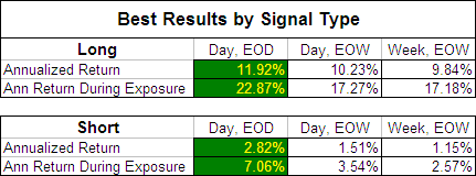
In our original MA test; Moving Averages – Simple vs. Exponential we revealed that once an EMA length was above 45 days, by using EOW signals instead of EOD signals you didn’t sacrifice returns but did benefit from a 50% jump in the probability of profit and double the average trade duration.  To see if this was also the case with the FRAMA we compared the best returns produced by each signal type:

FRAMA - Best Returns by Signal Type

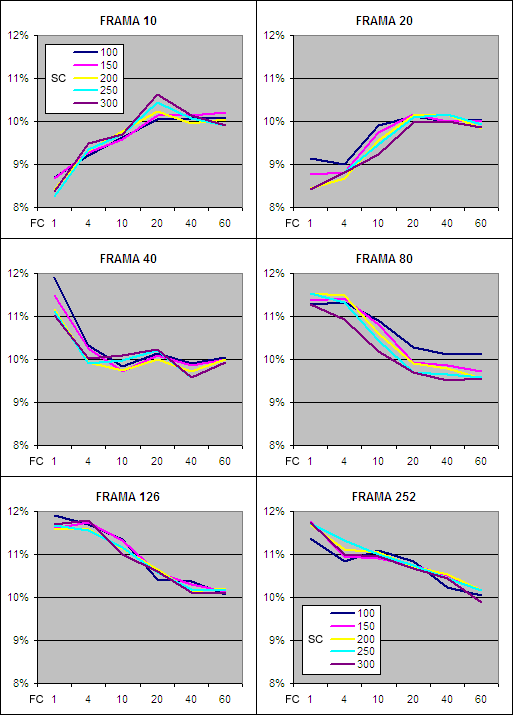
As you can see, for the FRAMA, Daily data with EOD signals produced by far the most profitable results and we will therefore focus on this data initially.  It is presented below on charts split by FRAMA period with the test results on the “y” axis, the Fast MA (FC) on the “x” axis and a separate series displayed for each Slow MA (SC).

FRAMA Annualized Return – Day EOD Long

FRAMA - Annualized Return, Long

The first impressive thing about the results above is that every single Daily EOD Long average tested outperformed the buy and hold annualized return of 6.32%^ during the test period (before allowing for transaction costs and slippage).  This is a strong vote of confidence for the FRAMA as an indicator.

You will also notice that the data series on each chart are all bunched together revealing that similar results are achieved despite the “SC” period ranging from 100 to 300 days.  Changing the other parameters however makes a big difference and returns increase significantly once the FRAMA period is above 80 days.  This indicates that the Fractal Dimension is not as useful if measured over short periods.

When the FRAMA period is short, returns increase as the “FC” period is extended.  This is due to the Fractal Dimension being very volatile if measured over short periods and a longer “FC” dampening that volatility.  Once the FRAMA period is 40 days or more the Fractal Dimension becomes less volatile and as a result, increasing the “FC” then causes returns to decline.

Overall the best annualized returns on the Long side of the market came from a FRAMA period of 126 days which is equivalent to about six months in the market, while a “FC” of just 1 to 4 days proved to be most effective.  Assessing the results from the Short side of the market comes to the same conclusion although the returns were far lower: FRAMA Annualized Return – Short.

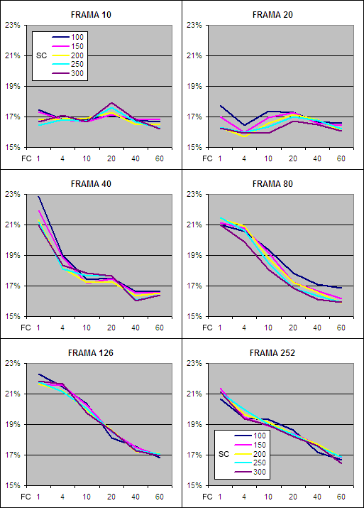
FRAMA Annualized Return During Exposure – Day EOD Long

FRAMA, Annualized Return During Exposure - Long

The above charts show how productive each different Daily FRAMA EOD Long was while exposed to the market.  Clearly the shorter FRAMA periods are far less productive and anything below 40 days is not worth bothering with.  The 126 day FRAMA again produced the best returns with the optimal “FC” being 1 – 4 days.  Returns for going short followed a similar pattern but as you would expect were far lower; FRAMA Annualized Return During Exposure – Short.

Moving forward we will focus in on the characteristics of the 126 Day FRAMA because it consistently produced superior returns.

FRAMA, EOD – Time in Market . . Because the 16 markets used advanced at an average annualized rate of 6.32%^ during the test period it doesn’t come as a surprise that the majority of the market exposure was to the long side.  By extending the “FC” it further increased the time exposed to the long side and reduced exposure on the short side.  If the test period had consisted of a prolonged bear market the exposure results would probably be reversed.

FRAMA, EOD – Trade Duration . . By increasing the “FC” period it also extends the average trade duration.  Changing the “SC” makes little difference but as the “SC” is raised from 100 to 300 days the average trade duration does increase ever so slightly.

FRAMA, EOD – Probability of Profit . . As you would expect, the probability of profit is higher on the long side which again is mostly a function of the global markets rising during the test period.  However the key information revealed by the charts above is that the probability of profit decreases significantly as the “FC” is extended.  This is another indication that the optimal FRAMA requires a short “FC” period.

The Best Daily EOD FRAMA Parameters . Our tests clearly show that a FRAMA period of 126 days will produce near optimal results.  While for the “SC” we have shown that any setting between 100 and 300 days will produce a similar outcome.  The “FC” period on the other hand must be short; 4 days or less.  John Ehlers’ original FRAMA had a “FC” of 1 and a “SC” of 198; this will produce fantastic results without the need for any modification. Because we prefer to trade as infrequently as possible we have selected a “FC” of 4 and a “SC” of 300 as the best parameters because these settings results in a longer average trade duration while still producing great returns on both the Long and Short side of the market: . FRAMA, EOD – Long . . Above you can see how the 126 Day FRAMA with a “FC” of 4 and a “SC” of 300 has performed since 1991 compared to an equally weighted global average of the tested markets.  I have included the performance of the 75 Day EMA, EOW becuase it was the best performing exponential moving average from our original tests. This clearly illustrates that the Fractal Adaptive Moving Average is superior to a standard Exponential Moving Average.  The FRAMA is far more active however producing over 5 times as many trades and did suffer greater declines during the 2008 bear market.

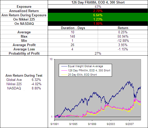
FRAMA, EOD – Short

126 Day FRAMA, EOD 4, 300 Short

On the Short side of the market the FRAMA further proves its effectiveness.  Without needing to change any parameters the 126 Day FRAMA, EOD 4, 300 remains a top performer.  When we ran our original tests on the EMA we found a faster average worked best for going short and that the 25 Day EMA was particularly effective.  But as you can see on the chart above the FRAMA outperforms again.

What is particularly note worthy is that the annualized return during the 27% of the time that this FRAMA was short the market was 6.64% which is greater than the global average annualized return of 6.32%.

126 Day FRAMA, EOD 4, 300 - Long and Short on Tested Markets

See the results for the 126 Day FRAMA, EOD 4, 300

126 Day FRAMA, EOD 4, 300 – Smoothing Period Distribution . With a standard EMA the smoothing period is constant; if you have a 75 day EMA then the smoothing period is 75 days no matter what.  The FRAMA on the other hand is adaptive so the smoothing period is constantly changing.  But how is the smoothing distributed?  Does it follow a bell curve between the “FC” and “SC”, is it random or is it localized around a few values.  To reveal the answer we charted the percentage that each smoothing period occurred across the 300 years of test data: . . The chart above came as quite a surprise.  It reveals that despite a “FC” to “SC” range of 4 to 300 days, 72% of the smoothing was within a 4 to 50 day range and the majority of it was only 5 to 8 days.  This explains why changing the “SC” has little impact and why changing the “FC” makes all the difference.  It also explains why the FRAMA does not perform well when using EOW signals, as an EMA must be over 45 days in duration before EOW signals can be used without sacrificing returns.

A Slower FRAMA

We have identified that the FRAMA is a very effective indicator but the best parameters (126 Day FRAMA, EOD 4, 300 Long) result in a very quick average that in your tests had an typical trade duration of just 14 days.  We also know that the 75 Day EMA, EOW Long is an effective yet slower moving average and in our tests had a typical trade duration of 74 days.

A good slow moving average can be a useful component in any trading system because it can be used to confirm the signals from other more active indicators.  So we looked through the FRAMA test results again in search a less active average that is a better alternative to the 75 Day EMA and this is what we found:


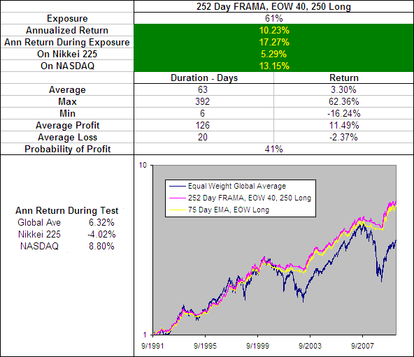
252 Day FRAMA, EOW 40, 250 Long.

The 252 Day FRAMA, EOW 40, 250 Long produces some impressive results and does out perform the 75 Day EMA, EOW Long by a fraction.  However this fractional improvement is in almost every measure including the performance on the short side.  The only draw back is a slight decrease in the average trade duration from 74 days to 63 when long.  As a result the 252 Day FRAMA, EOW 40, 250 has knocked the 75 Day EMA, EOW out of the Technical Indicator Fight for Supremacy.

252 Day FRAMA, EOW 40, 250 - Long and Short on Tested Markets
See the results for the 252 Day FRAMA, EOW 40, 250
Long and Short on each of the 16 markets tested.


 252 Day FRAMA, EOW 40, 250 – Smoothing Period Distribution

252-d-frama-eow-40-250-smoot


FRAMA Testing – Conclusion

The FRAMA is astoundingly effective as both a fast and a slow moving average and will outperform any SMA or EMA.  We selected a modified FRAMA with a “FC” of 4, a “SC” of 300 and a “FRAMA” period of 126 as being the most effective fast FRAMA although the settings for a standard FRAMA will also produce excellent results.  For a slower or longer term average the best results are likely to come from a “FC” of 40, a “SC” of 250 and a “FRAMA” period of 252.

Robert Colby in his book ‘The Encyclopedia of Technical Market Indicators’ concluded, “Although the adaptive moving average is an interesting newer idea with considerable intellectual appeal, our preliminary tests fail to show any real practical advantage to this more complex trend smoothing method.”  Well Mr Colby, our research into the FRAMA is in direct contrast to your findings.

It will be interesting to see if any of the other Adaptive Moving Averages can produce better returns.  We will post the results HERE as they become available. Well done John Ehlers you have created another exceptional indicator!

The post FRAMA – Is It Effective? appeared first on System Trader Success.

The Deadly Double Divergence

$
0
0

Would you be interested in an indicator that has signaled ten market tops since 1966 without a single false signal?  I read about such an indicator in an article titled “Double Divergences in the Advance-Decline Line,” which appeared in the November 2013 issue of Active Trader.  The article was written by Charles Kirkpatrick.

In the article, Kirkpatrick presented compelling evidence that double divergences in the cumulative advance-decline line are always followed by large bear market declines. Even more important, Kirkpatrick observed that a double divergence occurred on August 2, 2013.  Given that I currently have long equity positions; that certainly got my attention.  The following article examines the August 2013 double divergence and explores the implications for the market.

Market Breadth and the Advance-Decline Line

The cumulative advance-decline line is a running total of the number of advancing issues, less the number of declining issues for a specific list of securities. It is typically calculated on the NYSE, NASDAQ, and AMEX exchanges, but it can also be calculated on market indices. The advance-decline line is one of the many market breadth statistics, which are considered to be leading indicators and are widely used to identify major market turning points. If you would like to learn more about market breadth, please revisit one of my favorite articles “The Secret Weapon of Technical Analysis.”

Divergences and Double Divergences

Bearish divergences occur when a price series reaches a new high and the predictive indicator does not.  Two consecutive divergences are classified as a double divergence.  Sounds simple enough, but Kirkpatrick makes a critical observation:

“To ensure a divergence is complete and not the result of a timing difference, wait for both the index and a-d line to peak – that is, confirm a high is in place by moving lower. Sometimes the market index will reach a new high before the a-d line, suggesting a divergence is forming, but then become invalid when the a-d line later confirms the new market index high by making a higher high of its own.”

A bearish divergence occurs when the price series makes a higher high and the A-D line makes a lower high, but the highs in the price series and A-D line will not necessarily occur on the same date.  This is difficult to explain and challenging to code, but is easy to see on a chart.  Let’s look at the 2007 double divergence that foretold the 2008 market meltdown.

The top panel in Figure 1 below is a daily candlestick chart of the S&P 500 index from May 2007 to November 2007.  The bottom panel is the combined, cumulative A-D line for the NYSE, NASDAQ, and AMEX exchanges.  This brings up an important point, large comprehensive data lists produce better leading breadth indicators.  As a result, I use the combined breadth statistics for the the NYSE, NASDAQ, and AMEX exchanges when calculating breadth indicators for my systematic strategies.

In June of 2007, both the S&P 500 index and the A-D line made higher highs.  The first divergence occurred in July of 2007.  The S&P clearly made a higher high and the A-D line made a lower high.  The single bearish divergence led to a a sharp pullback, but the S&P 500 index rebounded and hit a new high in October 2007. Now look at the A-D line; it also peaked, but at a much lower level – the definition of a lower high.

This completed the deadly double divergence and correctly signaled the beginning of the great recession. In fact, the double divergence coincided with the high tick in the S&P 500 – the exact market peak.  Signals don’t get any better than that.

SP-500-2007

2013 Divergence

Now let’s look at the chart for 2013. The format for Figure 2 below is the same as Figure 1 above.  The top panel in Figure 2 below is a daily candlestick chart of the S&P 500 index from April 2013 to October 2013.  The bottom panel is the combined, cumulative A-D line for the NYSE, NASDAQ, and AMEX exchanges.

In May and July of 2013, both the S&P 500 index and the A-D line made higher highs. On August 2, 2013 (less than two weeks later), the S&P 500 made another higher high and the A-D line made a lower high (red vertical line below).   This was the first bearish divergence.

After a pullback, the S&P 500 and the A-D line both made higher highs in September and again in October.  Technically, October cannot yet be classified as a high because the S&P and the A-D line have not yet declined from their new highs.  However, both the S&P 500 and the A-D line will eventually record higher highs.

So where is the double divergence Kirkpatrick identified in his article?  It is not present in this data.  Why?  First Kirkpatrick used an alternative formula for calculating the A-D line (the Ayers A-D line).  Second, Kirkpatrick did not mention the list of securities used to calculate the A-D line in his article, but it could have been the S&P 500 index.  As I mentioned earlier, when used as a leading indicator, broad definitions of market breadth (NYSE+NASDAQ+AMEX) are much more reliable than narrow definitions (S&P 500).

So we have conflicting signals.  Kirkpatrick’ methodology recorded the first bearish divergence in late July of 2013 and the second bearish divergence on August 2, 2013.  My methodology only recorded a single bearish divergence on August 2, 2013.  As you can see below, my broader A-D line made a clear higher high in July 2013.

We have conflicting evidence.  Kirkpatrick recorded a double divergence and I recorded a single divergence.  So how do we proceed?  Fortunately, we do not need to rely on the subjective superiority of one method over the other. Even if we accept Kirkpatrick’s double divergence, it was nullified when the S&P 500 and the A-D line made successive higher highs again in September and again in October.  If the signal were valid, the A-D line would not have been able to make successive higher highs.

SP-500-2013

Conclusion

Market breadth statistics are very powerful leading indicators and I use them extensively in my systematic strategies.  Using divergences and double divergences leverage the power of breadth statistics even further.  Double divergences in the A-D line have been remarkably successful in identifying bear market moves.

Excluding August 2013, Kirkpatrick identified ten double divergences since 1966. Every one led to a significant bear market move.  On average, the S&P declined by 31.1% from the double divergence signal date to the market trough.  Based on Kirkpatrick’s research, the S&P 500 declined by 16.69% to 56.78% from the signal date.

In three instances, the market continued to rally for periods of 9 to 15 months, rising by another 2.63% to 19.8% after the double divergence signals. According to Kirkpatrick, the market failed to rally at all after the other seven double divergence signals. Remarkable!

I recommend using market breadth statistics and plotting bearish divergences and double divergences in your investment process.  However, it is critical to use a broad definition of market breadth to enhance the reliability of the resulting forecasts.

In addition, when looking for double divergences, large gaps in time and price are more meaningful than small gaps. In other words, I would be hesitant to rely on a double divergence that occurred in a span of a few trading days.  Likewise, a lower high in the A-D line that was only down slightly from the previous high would also be suspect.  Notice that the double divergence in 2007 spanned several months and resulted in large declines in the A-D line, which generated a very powerful bearish signal.

Finally, remember that bearish divergence or double divergence signals are nullified when both series record higher highs.

— Brian Johnson, Trader Edge

The post The Deadly Double Divergence appeared first on System Trader Success.

Looking Into The Ulcer Index

$
0
0

Investors utilize a variety of performance and risk metrics to evaluate strategies. These numbers provide a summary of what happened to the strategy historically and can be useful to quickly compare different strategies. To use these statistics effectively, it is helpful to look at some of the nuances of those frequently cited and cases where the information they provide could be misleading.

Many of the common metrics can be classified in ways that are similar to quantities we use to describe the world around us: temperature, speed, weight, voltage, etc. These classifications add context to what is being described based on how it is calculated and the information it contains.

In finance, one typical summary statistic is the annualized return of a strategy. To calculate this, all we need is the starting an ending point; what happened in between is irrelevant. Much like average speed simply uses the total time and distance traveled, annualized return smooths over any intermediate details. This is somewhat similar to a state variable in physics, such as temperature change, entropy, and internal energy, which depends only on the initial and final states.

If it were as simple as that, the two strategies shown below would be equivalent, but even a novice investor would likely choose to have owned strategy A.[1]
Equal-Return


Therefore, we look at metrics like annualized volatility, which incorporates the individual realized returns over a time period. We could call volatility a path dependent metric, much like mechanical work is in thermodynamics. It is a quantity that is likely to change if your “route” changes. However, annualized volatility only depends on what returns were realized, not in what order they came. This also applies to the Sharpe and Sortino ratios. To illustrate this concept, the following simulated paths both have the same realized volatility.

Same-Vol

To differentiate between these two strategies using summaries statistics, we must capture the sequence of the returns. Maximum drawdown does this by measuring the worst loss from peak to trough over the time period. Still, maximum drawdown lacks information about the length of the drawdown, which can have a substantial impact on investors’ perception of a strategy. In fact, Strategies B and C shown previously have the same maximum drawdown of 25%.[2]

Enter the Ulcer Index. It not only factors in the severity of the drawdowns but also their duration. It is calculated using the following formula:

Ulcer-Index1

where N is the total number of data points and each Ri is the fractional retracement from the highest price seen thus far. Whereas, the maximum drawdown is only the largest Ri, which can only increase through time, the Ulcer Index encapsulates every drawdown into one summary statistic that adapts to new data as it is realized.[3] Using the Ulcer Index, we can finally distinguish between strategies that have the same annualized return, annualized volatility, and maximum drawdown: Strategies B and C have Ulcer Indices of 11.2% and 12.8%, respectively.

As a case study, the following chart shows the return of a 60/40 portfolio of SPY and AGG rebalanced at the beginning of each year from 01/2004 to 12/2013. Along with the true realized path, I have included the path with the returns reversed and 5 paths with random permutations of the true returns.

60-40

The metrics for each path are shown in the table below:

Table

Only the Ulcer index can fully differentiate among these paths. Even in cases where the maximum drawdown is similar (e.g. the true path and Random 1), the Ulcer Index shows a sharp contrast between the strategies.

For a more concrete way of picturing the Ulcer index, imagine driving a car along a 55 mph speed limit road with stoplights spaced every half mile. Traffic is moderately heavy and the lights are poorly timed. As you accelerate, the light down the road turns yellow and then red. Easing off the accelerator will increase the time until you get to that light, perhaps to the point where you won’t have to stop, thus reducing the amount of time spent waiting for the light to change and the subsequent acceleration to approach the speed limit again.

You continue down the road anticipating the lights so that you do not brake when unnecessary or burn needless gas racing toward red lights. This not only reduces the variation in your speed (a volatility) but also the amount you have to slow down (the severity) and the time spent waiting at red lights (the duration). The smoother trip is likely to lead to less stress, not to mention wear and tear on the car, which can cause further headaches.

Ultimately, evaluating a strategy involves more than simple performance metrics since the methodology driving the strategy is key. But when comparing historical performance, it is helpful to have a toolbox equipped with implements able to measure performance on the bases of profitability and risk in ways that are amenable to our inherent, risk-averse inclinations.

— By  Nathan Faber from Flirting With Models. Nathan Faber is an Associate in Newfound’s Product Development and Quantitative Strategies group. Newfound is a Boston-based registered investment advisor and quantitative asset manager focused on rule-based, outcome-oriented investment strategies and specializes in tactical asset and risk management.

[1] One exception is if you owned another strategy that had the correct characteristics relative to strategy B (negative correlation, positive return, and similar volatility) so that the overall return was even smoother than strategy A. Even so, these trends would not have any guarantee of continuing in the future.

[2] In simulations this is easy to do by reversing the order of the returns.

[3] Perhaps another interesting metric would be an exponentially weighted Ulcer Index that places more weight on more recent observations.


The post Looking Into The Ulcer Index appeared first on System Trader Success.

The Bullish Outside Month

$
0
0

I came across an article over at the blog, Jay On The Markets, that talked about applying a bullish outside indicator on a monthly chart. The article I was reading is titled, “One Sign That the Bull May Still Have Legs“. In this article Jay talks about the incredible run the U.S. broad market has experienced as of late. Remarking that “The Trend is Your Friend”, Jay goes on to highlight a potential bullish indicator which appears on the monthly chart of the S&P. The indicator is a bullish outside month.

I thought I would spend some time testing this indicator and see what the results may tell. Of course, the code used to test this indcator appears at the bottom of this article.

A Bullish Outside Month

A Bullish Outside Month happens when…

  1. Current month’s low is less than or equal to last month’s low
  2. Current month’s close is greater than last month’s high

In EasyLanguage this could be written as follows:

Variable BullishOM;

BullishOM = ( Low <= Low[1] ) And ( Close > High[1] );

If ( BullishOM ) Then Begin
   // Code for when Bullish Outside Month Happens
   End
Else Begin
   // Code for when Bullish Outside Month Does NOT hapen
   End;

This above code will determine if a Bullish Outside Month has occurred and provides a conditional test to take action based upon the result. The result in this case, is a boolean value indicating if a Bullish Outside Bar occured.

To test the effectiveness of BOM I’m going to create a simple TradeStation strategy based on the code above. When a BOM occurs I will puchase shares and hold for X number of bars. Jay performed his test on a monthly chart. I will duplicate that here. I will then also apply the BOM strategy on a weekly and daily chart.

Testing Environment

I decided to test the strategy on the S&P cash index going back to 1960. The following assumptions were made:

  • Starting account size of $100,000
  • Dates tested are from 1960 through May 2014
  • The entire account value will be put at risk for each trade
  • The P&L is not accumulated to the starting equity
  • There are no deductions for commissions and slippage
  • No stops were used

I used TradeStation’s optimize feature to test the holding period of 0 through 11. This holding period represents the number of bars to hold an open trade. Each bar represents a single interval of time based upon the type of chart I’m backtesting. For example, on a monthly chart the holding period represents weeks, while the daily chart represents days. So why do I start at the value of zero? This is a little nuance on how EasyLanguage works when executing simple market orders. Essentially this means open and close the trade on the current bar. So, the trade is opened at the “open” of the current bar and the trade is then closed on that bar. Except the trade is actually closed at the “open” of the next bar. Thus, a holding period of zero is a one bar hold. Clear as mud, right?

In the end what we are doing is testing the market’s behavior after a bullish outside bar appears. The bar graphs below represent net profit generated by the system based upon the holding period.

Monthly Results

The bar graph below represents the net profit (y-axis) generated on a monthly chart based upon the holding period (x-axis). It’s interesting to note that profit tends to climb as you increase the holding period. In this test net profit peeks at the 9 month holding period. The values of of 8, 9 and 11 maintain about the same level of net profit.

Bullish_Outside_Bar_Monthly


Does this tell us anything? At first glance it does appear that after our BOM event there is an edge in going long, but we have to remember the market is bias to the long side. There are many indicators that you could use that will show a positive edge.

What is an interesting observation on the chart of this strategy is it does appear to avoid the major bear markets. Notice how no trades are opened during the two bear markets after 2000 and 2007. Click on the chart for a larger view. Only after the market started to recover did we see signals. Is this just a fluke or does the BOM on a monthly chart really help tell us the market is due for new highs over the coming months? On the monthly chart we only have 17 data points, so this is far from a significant number.

Bullish Outside Bar Monthly Chart

Monthly Chart With Bullish Outside Bar Applied

The next chart is a depiction of the drawdown experienced when holding each trade. Notice we experienced drawdowns as high as 24% during the 70s however, starting the in late 1980s until present day, the drawdown has been tiny (under 4%). This means our positions have taken very little heat. Again, is this just a fluke?

Bullish_Outside_Bar_Monthly_Drawdown

Drawdown

Weekly Results

The bar graph below represents the net profit (y-axis) generated on a weekly chart based upon the holding period (x-axis). Here we see a very different picture. When this strategy is applied to a weekly chart we see very poor performance for the first 10 weeks or so. I’m guessing that our BOM on the weekly chart appears to be a shorter term exhaustion indicator which more likely tells us the market will consolidate and/or have a slight pullback over the coming weeks.

Bullish_Outside_Bar_Weekly


Picking a value of 19 (20-week holding period) we have 63 trades over the duration of the backtest with an average profit of $2,141.  Below is the equity graph and weekly drawdown graph.

Bullish_Outside_Bar_Weekly_EQ_Curve

20 Week Holding Period Equity Graph

Bullish_Outside_Bar_Weekly_Drawdown

Weekly Drawdown on 20 Week Holding Period


Daily Results

The bar graph below represents the net profit (y-axis) generated on a daily chart based upon the holding period (x-axis). This chart appears most like the monthly chart. All holding periods appear to be profitable and in general, the longer you hold the more net profit you make.


Bullish_Outside_Bar_Daily

Picking a value of 29 (20 day holding period) we have 145 trades over the duration of the backtest with an average profit of $930.  Below is the equity graph and weekly drawdown graph. The equity graph is not nearly as “clean” on the weekly chart. There is a large break in the equity curve during the financial crash of 2007 and 2008. Could this be the start of a trading system? It very well could be.

Bullish_Outside_Bar_Daily_EQ_Curve

20 Day Holding Period Equity Graph

Bullish_Outside_Bar_Daily_Drawdown

Weekly Drawdown on 20 Day Holding Period

Download

The post The Bullish Outside Month appeared first on System Trader Success.


Modified Chartmill Value Indicator (MCVI)

$
0
0

I read about this indicator in an article titled “The Chartmill Value Indicator,” which appeared in the January 2013 issue of Technical Analysis of Stocks and Commodities. The article was written by Dirk Vandycke. In the article, Vandycke introduced an interesting oscillator called the Chartmill Value Indicator (CVI). The following article explains the CVI formulas, proposes a modified version of the CVI (MCVI), and demonstrates the potential of the MCVI with a sample pullback strategy. AMIBroker code for the MCVI is included at the end of the article.

The Modified Chartmill Value Indicator (MCVI)

The CVI represents a standardized deviation from a moving average, which can be applied to any price series over any period. The concept is simple. As prices rise, they will eventually rise above a moving average. Eventually, the moving average will begin to rise as well. At this point, prices need to continue to rise to increase the spread between the current price and the underlying moving average. When prices begin to level off or consolidate, the spread will begin to decline as the moving average continues to rise.

This behavior makes it very difficult for the deviation from a moving average to remain in the overbought or oversold regions for extended periods, which represents a significant improvement over other oscillators such as the RSI and Stochastic indicators.

However, a simple price spread from a moving average would not be comparable across all securities, which would preclude us from using the spread in systematic strategies. Fortunately, Vandycke addresses this problem by dividing the spread by the average true range, which is dependent on both the price level and volatility of the underlying security. Here are Vandycke’s formulas from the article (with slight changes in notation):

  • n = user specified number of periods
  • Value Consensus (VC) = MA((H+L)/2, n)
  • True High (TH) = Max(H, Ref(C,-1))
  • True Low (TL) = Min(L, Ref(C,-1))
  • True Range (TR) = TH – TL
  • Average True Range (ATR) = MA(TR, n)
  • CVI = (C – VC) / ATR

I like this type of indicator and have used similar versions in my algorithmic strategies and in my discretionary trading. However, I feel that the CVI formulas require one important change. Values for the original version of the CVI are not directly comparable across different time periods (n). In other words, it is much easier to achieve large positive or negative values for CVI (large deviations from the moving average), when the number of periods (n) is large.

From option pricing theory, we know that the magnitude of price changes is a function of time, but the relationship is not linear. Instead, price changes are proportional to the square root of time. If we assume that ATR (in the denominator of the CVI formula) is a proxy for volatility, then we can normalize the influence of time on CVI by multiplying ATR by the square root of the number of periods (n ^ 0.5). This adjustment is not perfect, because the moving average moves through time as well, but it is better than not adjusting volatility for time at all. Below is the revised formula for the modified Chartmill Value Indicator:

Modified Chartmill Value Indicator (MCVI) = (C – VC) / (ATR * (n ^ 0.5))

A Sample MCVI Reversal Strategy

When I evaluate a new indicator, I typically use AMIBroker to build a simple test strategy to better understand how the indicator works and how it could be used to add value. Since the MCVI is an oscillator, I created a weekly reversal strategy to buy when conditions were oversold and sell when the market was overbought.

These types of reversal strategies can be profitable, but the key is to only take trades in the same direction as the long-term trend. For the sample strategy below, I used a simple moving average filter, only taking long trades when the closing price was above the long-term moving average and only taking short trades when the closing price was below the moving average.

I optimized the strategy based on weekly values of the S&P 500 Index, the Russell 2000 index, and the NASDAQ 100 index from January 2000 to January 2013. Only one trade was permitted at a time and each trade represented 100% of portfolio equity. No stops were used. The purpose of this exercise was a proof-of-concept only. As a result, I did not withhold an out-of-sample data set. While the example below was based on weekly periods, the MCVI could be used for daily periods as well.

Optimized Parameters:

  • User Specified Look-back period (n): 3 weeks
  • Long Entry: Weekly CVI crosses below -0.51
  • Short Entry: Weekly CVI crosses above +0.43
  • Moving Average Filter Periods: 46 weeks
  • Long Exit: After 7 weeks
  • Short Exit: After 3 weeks

The top panel in Figure 1 below is a weekly candlestick chart of the NASDAQ 100 index (NDX) from late 2009 to January 2013. The blue line signifies the 46 week moving average that was used to filter long and short trades. The middle chart pane uses a histogram to depict the weekly MCVI readings. The bullish and bearish signal thresholds from the optimized strategy are represented by the dark green and dark red horizontal lines, respectively.

The bright green arrows represent prospective signals that met all of the strategy criteria. Note: not all of these trades would have been executed. Remember, only one position was permitted at a time and the strategy was tested on three different indices. In addition, trades remained open for multiple weeks. Nevertheless, the prospective signals should help you understand the types of trades executed by the MCVI reversal strategy.

It is interesting to note that the latest weekly CVI reading (on 1/11/13) for the NDX was above the bearish threshold. However, no strategy signal was warranted due to the moving average filter. Nevertheless, the NDX was overbought.

Figure1: NASDAQ 100 Index – Modified CVI Chart

Figure1: NASDAQ 100 Index – Modified CVI Chart

The third panel illustrates an enhanced SWAMI chart for the MCVI. I have written about SWAMI charts a number of times on this site. Briefly, enhanced SWAMI charts use color gradients to depict indicator values for a wide range of indicator periods on the same chart.

The blue line represents the average CVI value across the entire range of periods. The purple line is a moving average of the blue average SWAMI MCVI line. While I did not use the MCVI enhanced SWAMI indicator in the sample strategy, notice how effectively the extreme enhanced SWAMI levels identified prospective market turning points.

MCVI Strategy Results

The optimized MCVI strategy earned a compound annual return of 12.28%, but was only invested 34.41% of the time. The resulting risk-adjusted annual return was 35.69%. The maximum peak to trough drawdown was 17.80%, which resulted in a respectable CAR/Maximum Drawdown ratio of 0.69.

71.74% of the trades were profitable and the average profit on winning trades was 5.93% versus an average loss of -2.81% on the losing trades. The corresponding profit factor was 4.69; total gains were 4.69 times total losses. The Sharpe ratio was 1.64. The comprehensive strategy statistics are provided in Figure 2 below.

Figure 2: MCVI Reversal Strategy Results

Figure 2: MCVI Reversal Strategy Results

The equity curve is provided in Figures 3 below.

Figure 3: MCVI Strategy – Equity Curve

Figure 3: MCVI Strategy – Equity Curve

The equity drawdown curve is provided in Figure 4 below. The maximum drawdown was 17.8%, but drawdowns have remained below 10% since 2002.

Figure 4: MCVI Strategy – Equity Drawdown

Figure 4: MCVI Strategy – Equity Drawdown

MCVI AMIBroker Code

As promised, below is the AMIBroker code for the MCVI. It is a screenshot from my AMIBroker platform, so you would need to retype the code into your AMIBroker platform if you would like to experiment with the MCVI. The MCVI compiles and runs without error on my platform, so if you encounter any errors, they are probably the result of typos.

Note, the code below is for the MCVI, not for the MCVI strategy – although the sample parameters in the code below are the optimized parameters for the strategy.

Figure 5: MCVI AmiBroker Code

Figure 5: MCVI AmiBroker Code

As always, the sample code and strategy are presented for educational purposes only and are not intended as investment advice. In fact, I do not consider the MCVI sample strategy above to be viable in its current form – due to the lack of stops, which precludes any means of position sizing or risk management.

After initially publishing this article, several readers requested a copy of the actual MCVI strategy code (in addition to the indicator code above). If you read the comments below the article, you will see that I initially attempted to copy and paste the strategy code in my reply, but WordPress corrupted the AMIBroker code. As a result, I am including an image of the actual AMIBroker strategy code in Figure 6 below. The code in the image below is the actual AMIBroker code that generated the results in Figures 2, 3, and 4 above.

Figure 6: MCVI AmiBroker Strategy Sample Code

Figure 6: MCVI AmiBroker Strategy Sample Code

Conclusion

The MCVI and enhanced SWAMI MCVI show promise for use in systematic and discretionary strategies. While optimized, the strategy results were impressive, especially for only using a single indicator and a simple moving average filter in the strategy. Ideally, strategies should use several different types of indicators for trade confirmation.

The formula modification to create the MCVI (versus the CVI) is important, without which it would not be practical to generate a SWAMI version of the indicator.

— Brian Johnson, Trader Edge

The post Modified Chartmill Value Indicator (MCVI) appeared first on System Trader Success.

MCVI Indicator and Strategy on Daily Charts

$
0
0

In a recent article, “Modified Chartmill Value Indicator“, the author presented an indicator that might prove helpful in your trading. The indicator is an oscillator which highlights overbought and oversold conditions. The author created a simple test strategy to test the effectiveness of the strategy. The results looked promising and you can read about them here.

The original article provided the indicator and strategy as Amibroker code. I’ve received many requests to provide an EasyLanguage equivalent. So here it goes.

The MCVI Indicator

The EasyLanguage code is at the bottom of this article. It’s available as a text file and as an ELD file which can be imported directly into your TradeStation Development Environment. Below is an example of the MCVI applied to the daily chart o the S&P.

MCVI_Example

MCVI Indicator (Lower Pane) on Daily Chart of Emini S&P

Trading Model Rules

The original article tested the indicator on weekly data of the S&P 500 Index, the Russell 2000 index, and the NASDAQ 100 index from January 2000 to January 2013. I would like to perform a similar test with daily data in order to generate a few more trades. I will be using the same buy/sell triggers and market regime filter as the original article.

  • User Specified Look-back period (N): 15 days
  • Long Entry: MCVI crosses below -0.51
  • Short Entry: MCVI crosses above +0.43
  • Moving Average Filter Periods: 230 days
  • Long Exit: After 35 days
  • Short Exit: After 25 days

If you review the original article, you can see I simply took the weekly parameters and multiplied them by five to generate my daily parameters. The assumption is there are five trading days in one week.

Testing Environment

Before getting into the details of the results, let me say this: all the tests within this article are going to use the following assumptions:

  • Starting account size of $25,000
  • Dates tested are from 1997 through December 31, 2013
  • One contract was traded per signal
  • The P&L is not accumulated
  • $30 was deducted per round trip for slippage and commissions
  • There are no stops

In-Sample Results

The original article used a period through December 31, 2013 to optimize the inputs. Thus, I’m calling this segment of the data our in-sample segment. Below is how the strategy performed with a $25,000 account applied for each of the three markets.

MSVI IN Sample Results


MCVI_ES_In_Sample_EQ_Curve

MCVI_NQ_In_Sample_EQ_Curve

MCVI_TF_In_Sample_EQ_Curve

Conclusion

We succeed at generating more trades by moving the timeframe to a daily bar. During our testing we used the same optimized parameters generated on a weekly chart yet, they held up well on our test. I would guess that optimization on the daily chart would produce even more optimal returns. The equity charts look decent accross our three differnt markets, which is not too surprising since they are correlated.

As stated in the original article, this trading model is nothing more than a test of the MCVI indicator. This is not a trading system that can be traded with money. However, it might be possible to use this indicator in building your own systems.

Download

MCVI Strategy  (ELD file)
MCVI Indicator  (ELD file)
MCVI Wordspace (TWS file)

MCVI Indicator (text file)
MCVI Strategy (text file)

The post MCVI Indicator and Strategy on Daily Charts appeared first on System Trader Success.

Understanding the Relationship Between Stocks & Bonds

$
0
0

Intermarket Analysis is the comparison of potentially related markets. For example:

  • S&P500 and 30 Year Treasury Bonds
  • 30 Year Treasury Bonds and Gold
  • S&P500 and Japanese Yen
  • Shanghai Composite Index and Aussie Dollar, etc.

The problem with using TradeStation for any Intermarket Analysis is the dreaded “You may not mix symbols with different delays in the same window” error code. That’s exactly what you’ll get if you try to add 30 Year Treasury Bond Futures (symbol US) to an Emini chart (symbol ES). The problem arises because the data comes from two different exchanges – CBOT for Bonds and CME for the Emini. TradeStation says:

Tradestation limitation
TradeStation does not allow you to plot two symbols in the same chart window when the amount of delay for the data is different. For example, one is delayed and one is real-time, or both are delayed but the exchanges providing the symbols’ data delay by different amounts of time. Otherwise, during the market session, you would see last prices on the current bar that are asynchronous (i.e. not simultaneous).

There are various ways around the problem – most of them quite complex and involving exchanging data between charts. However, I have found an easier solution. Read on for some tricks of the trade and useful equities vs. bonds indicators.

Using ETFs for Intermarket Analysis

equities_vs_bonds

The solution to the problem is to find market symbols from the same exchange. With the explosion in the number of Exchange Traded Funds (ETFs) it is usually possible to find ones that track the underlying markets you are interested in.

For the Emini the obvious choice is the SPDR (symbol SPY) ETF traded on the AMEX exchange. For the Bond market the best choice is the iShares Lehman 20+ Year Treasury Bond ETF (symbol TLT), also traded on the AMEX exchange.

In the left panel of the chart above, daily data for the SPY and TLT symbols have been plotted quite happily on the same chart. However, in the right panel you get the dreaded “mix symbols” error code when plotting the ES and US symbols.

Are the Emini and Bond Markets Correlated?

The answer is sometimes yes and sometimes no. Correlation between the two markets can go as high as +60% (correlated) or a low as -60% (negatively correlated). You can add the in-built TradeStation correlation indicator on a chart of SPY and TLT to see this for yourself.

There are 2 opposing factors that drive the Bond and Stock markets at different times:

  • Interest rates might be falling and causing Bond prices to rise. The stock market might view the lower interest rates as encouraging for the economy and respond with higher stock prices. Alternatively, rising interest rates will cause Bond prices to fall and the stock market might view the tightening as negative for the economy and stock prices. In these cases correlation between the two markets is positive as they are moving in sync.
  • Stocks and Bonds are also alternative investment vehicles. If the stock market is rising strongly it might encourage Bond investors to cash out and put their money in the stock market and thereby cause Bond prices to fall. Alternatively, if there is a stock market panic investors might rush for the safety of Bonds and push Bond prices up. In these cases the two markets are negatively correlated as they are moving in opposite directions.

Measuring Differences Between the Emini and Bond Markets

SpreadELD

With SPY and TLT plotted on the same chart we can compare price movements. A popular oscillator is shown in the screen grab above. In this case a ratio of SPY and TLT is calculated and this value is compared to a moving average of the ratio.

I prefer to use another measure of relative price movement. The screen grab below shows TradeStation EasyLanguage code for my Bond Oscillator. Instead of using the ratio of SPY and TLT prices it calculates the difference in percentage movement. This indicator is more like a momentum indicator.

BondELD

The two indicators are compared below. The Bond Oscillator (momentum type) is shown above and the Spread Oscillator (moving average type) is shown below. As you can see, the Bond Oscillator generates more defined turning points and is easier to trade.

OscillatorsCompared

The chart below shows the Bond Oscillator added to a 3 year chart of daily SPY prices. Spikes (up and down) in the oscillator show periods when the SPY is over or under-valued against Bonds. These periods can persist for some time – more so on the upside than the downside. To illustrate this a PaintBar has been added to highlight periods when the Bond Oscillator is above +5 (shown as white bars) and below -5 (shown as red bars).

BondOscillator

Rather than use extreme readings on the Bond Oscillator to enter trades, it is safer to wait until the Oscillator crosses the zero line after an extreme reading. This prevents entering the trades too early.

Another trick I have found using this indicator is to wait for an extreme Oscillator reading and then look for a large daily move in the opposite direction in the Bond market. For example, Bonds are in a down trend, the Bond Oscillator goes above +5 and then Bonds have a one-day large up move. This pattern is signaling that professionals are taking profits at stock market highs and reaching for the safety of Bonds, hence driving Bond prices higher.

TradeStation EasyLanguage code for the PaintBar is shown in the screen grab below.

PaintbarELD

Bond Market Turning Points and the Emini

The last series of Bond Intermarket indicators are designed to highlight market turning points. I have found that there is a tendency for the Emini to lag the Bond market by approximately 20 days. To illustrate this point check out the chart below.

20DayDelay

The SPY (Emini equivalent) is shown in the top of the chart and below it is TLT (Bond market equivalent) with closing prices shifted by 20 days. The red vertical lines show how turning points in the two markets (one delayed by 20 days) often line up. The neat thing about this analysis is that the Bond market turning points are known well in advance.

As an aside, this 20 day delay is also the reason I use 20 days as the look back period in the previous two indicators, Spread Oscillator and Bond Oscillator.

The chart below shows the state of the current Bond market (mid April 2007). A vertical line has been added showing where prices were 20 days ago. As you can see, since then the Bond market has declined steeply. If the 20 day relationship holds we may well see another turning point in the stock market. Only time will tell.

VerticalLine

If you’re interested in following turning points in the Bond market you can use the indicator below to plot these vertical lines. The indicator allows multiple vertical lines of different frequencies to be plotted. Just vary the inputs NumLines (number of vertical lines) and Period (20 days, etc.). Make sure there’s enough back history in the chart to plot the lines though – if you ask for two 200 day lines and only have 300 days of history on the chart, the indicator won’t work!

VerticalELD

I hope this article on Intermarket Analysis and equities versus bonds was helpful to you. Download the indicator code used in this analysis from the link below.


Downloads

Bond Indicators (TradeStation ELD)


— Barry Taylor of Emini Watch

“I’m not a trading Guru and I haven’t discovered the Holy Grail. I’m just a regular guy who makes a living day trading Emini futures full-time. This website shows what works for me and is a record of how my trading methodology is evolving.” Read more at Emini Watch.

The post Understanding the Relationship Between Stocks & Bonds appeared first on System Trader Success.

Distance Weighted Moving Averages (DWMA and IDWMA)

$
0
0

The distance weighted moving average is another nonlinear filter that provides the basis for further research and exploration. In its traditional form, a distance weighted moving average (DWMA) is designed to be a robust version of a moving average to reduce the impact of outliers. Here is the calculation from the Encyclopedia of Math:

DWMA Chart

Notice in the example above that “12” is clearly an outlier relative to the other data points and is therefore assigned less weight in the final average. The advantage of this approach to simple winsorization (omitting outliers that are identified from the calculation) is that all of the data is used and no arbitrary threshold needs to be specified. This is especially valuable for multi-dimensional data. By squaring the distance values in the calculation of the DWMA instead of simply taking the absolute value, it is possible to make the average even more insensitive to outliers. Notice that this concept can be also reversed to emphasize outliers or simply larger data points. This can be done by removing the need to invert the distance as a fraction and simply using the distance weights. This can be called an “inverse distance moving average” or IDWMA, and is useful in situations where you want to ignore small moves in time series which can be considered “white noise” and instead make the average more responsive to breakouts. Furthermore, this method may prove more valuable for use in volatility calculations where sensitivity to risk is important. The chart below shows how these different moving averages respond to a fictitious time series with outliers:

DWMA Comparison

Notice that the DWMA is the least sensitive to the price moves and large jumps, while the IDWMA is the most sensitive. Comparatively the SMA response is in between both the DWMA and IDWMA. The key is that neither moving average is superior to one another per se, but rather each is valuable for different applications and can perform better or worse on different time series. With that statement, let’s look at some practical examples. My preference is typically to use returns rather than prices, so in this case we will look at applying the different moving average variations: the DWMA, IDWMA and SMA to two different time series – the S&P500 and Gold. Traders and investors readily acknowledge that the S&P500 is fairly noisy- especially in the short-term. In contrast, Gold tends to be unpredictable using long-term measurements, but large moves tend to be predictable in the short-term. Here is the performance using a 10-day moving average with the different variations from 1995 to present. The rules are long if the average is above zero and cash if it is below (no interest on cash is assumed in this case):

DWMA Return S&P

DWMA Return of Gold

Consistent with anecdotal observation, the DWMA performs the best on the S&P500 by filtering out large noisy or mean-reverting price movements. The IDWMA in contrast performs the worst because it distorts the average by emphasizing these moves. But the pattern is completely different with Gold. In this case the IDWMA benefits from highlighting these large (and apparently useful trend signals), while the DWMA performs the worst. In both cases the SMA has middling performance. One of the disadvantages of a distance weighted moving average is that the calculation ignores the position in time of each data point. An outlier is less relevant if it occurs for example over 60 days ago versus one that occurs today. This aspect can be addressed through clever manipulation of the calculation. However, the main takeaway is that it is possible to use different weighting schemes for a moving average for different time series and achieve potentially superior results. Perhaps an adaptive approach would yield good results. Furthermore, careful thought should go into the appropriate moving average calculation for different types of applications. For example, you may wish to use the DWMA instead of the median to calculate correlations, which can be badly distorted by outliers. Perhaps using a DWMA for performance or trade statistics makes sense as well. As mentioned earlier, using an IDWMA is helpful for volatility-based calculations in many cases. Consider this a very simple tool to add to your quant toolbox.

– By David Varadi of CSSA

The post Distance Weighted Moving Averages (DWMA and IDWMA) appeared first on System Trader Success.

Win Rate EasyLanguage Code

$
0
0

In the article,Win Rate The Most Important Metric, Michael Harris discusses the importance of Win Rate when it comes to building a profitable trading system. I spent a few minutes creating an EasyLanguage function that can be used during your development process in calculating the Win Rate for you. The function can be applied to any strategy. It’s capable of returning the Win Rate and displaying it within the print window. Below is a short video explaining the function.


The most important metric…free download.
Click To Tweet


Downloads

Win Rate Function Code (TradeStation ELD or Text File)

The post Win Rate EasyLanguage Code appeared first on System Trader Success.

How to Trade the MACD: A High-level Analysis of the MACD Line Feature

$
0
0

Moving Average Convergence Divergence (MACD) is one of the most popular technical indicators used by traders.

It is a flexible indicator that can be used for determining the strength and direction of a trend. It has three distinct features and in this first post we are going to do a high-level analysis of one of those features, the MACD Line.

We will compare three of the most common MACD Line settings on the EUR/USD using daily bars over the past few years to determine whether or not there is a historical pattern that can be exploited.

What is the MACD Line?

The MACD Line was the first feature developed in the MACD indicator. It was developed around 1977 by Gerald Appel. The other two features are the MACD Signal Line, a smoothed average of the MACD Line, and the MACD Histogram, which is the difference between the Signal Line and the MACD Line.

MACD Indicator on EUR/USD 1-Day Bars

The MACD Line is composed of a fast and slow moving average. The value of the MACD Line is the difference between the two moving averages. The default settings for the two moving averages are typically 12-period (fast) and 26-period (slow) exponential moving averages and are generally calculated off of the close price of an asset. Using the MACD Line is the exact same as using a moving average cross. If you subtract the price of a fast-period moving average from the price of a slow-period moving average, you will get the value of the MACD Line. Gerald Appel also commonly uses default periods of 19- and 39-period EMAs while Tom Aspray, who added the histogram feature and studied the MACD in the 1980s commonly uses 10- and 20-period EMAs.

Gerald Appel claims, “As a general rule of thumb, the market climate is most unfavorable when the MACD is falling and below zero.” We’ll take the latter part of his rule of thumb to form our hypothesis; it is unfavorable to go long when the MACD Line is below 0 and it is unfavorable to go short when the MACD Line is above 0.

Using TRAIDE we can test exactly how favorable and unfavorable the market is when the MACD Line is above and below zero; We will try to find values of the MACD Line that lead to bullish and bearish moves the following day by looking at every trading day between August 1st, 2012 and March 24, 2015.

MACD Line (12, 26-Period EMAs) Analysis

TRAIDE automatically generates a histogram of the empirical data to display the distribution of the MACD Line values over our date range. The histogram will show how many of the next days’ bars closed up and how many closed down for every MACD Line value over our date range.

To create the histogram, we will first select the asset we want to analyze, the timeframe and date range. We then select the MACD Line feature under the MACD indicator group in the middle column of TRAIDE’s Strategy Creation page. We can ignore the “Signal Moving Average Type” and “Signal Period” in the indicator settings because we are not using the MACD Signal feature.

Selecting the MACD in TRAIDE

Let’s click analyze and look at the distribution.

MACD Line EUR/USD Distribution

  • y-axis: The number of trades, or trading days, between 08/01/2012 and 03/24/2015.
  • x-axis:The values of the MACD Line, ranging from -0.026 to 0.018.
  • Dividing lines on x-axis: This is the width of a “bin”. There are 10 bins and the edges of the bins are labeled. For example, -0.022 to -0.018 is one bin.
  • Red bars: The height of red bars represents the number of trading days where the following day was bearish, or the close was lower than the open, in any particular bin.
  • Green bars: The height of green bars represents the number trading days where the following day was bullish, or the close was higher than the open. in any particular bin.
  • Shading of the bars: We won’t be using the shading, but this is the strength of signal for that bin. Darker green means that the algorithms found strong signals to go long and darker red bars means that TRAIDE’s algorithms found strong signals for going short.

Using our distribution, let’s test our hypothesis.

The first step is to remove the ambiguous information. The red and green bars in bin -0.002 (-20 pips) to 0.002 (20 pips) straddle the zero line; we don’t know whether the next day closed up or down since we cannot distinguish between the trades that occurred right around zero.

The next step is to click all of the green bars above 0.002 and all of the red bars below -0.002 and see what the accuracy is in our statistics table for each case. When we select the green bars, we are going long for all positive values of the MACD Line above 0.002 and going short for all negative values below -0.002. We want to see if just this simple rule will lead to over 50% of our trades being correct.

Selecting Positive and Negative MACD Line Values

What we find is that when the MACD Line is positive, the price on the next day tends to close higher than the previous bar’s close and when the MACD Line is negative, the price on the following day tends to close below the current day’s close. There were 640 trades in our sample.

It turns out that our hypothesis is true. There is a historical pattern; when the MACD Line is negative (less than -0.002), the next day is bearish 52% of the time and presents an unfavorable condition to go long. When the MACD Line is positive (greater than 0.002), the next day is bullish 54% of the time, presenting an unfavorable condition for going short.

Let’s dive in a little bit deeper and see if we can refine our MACD Line values. From the distribution, it looks like the tail ends of the histograms don’t present a clear historical pattern while the histogram bars on either side of the -0.002 to 0.002 bin appear to have a clear pattern.

Finding the Best Values for Long or Short (MACD Line (12, 26))

On the days where the MACD Line is greater than 0.002, but less than 0.006, the next day was bullish 58% of the time with 183 total trades. In other words, when the 12-period EMA is between 20 and 60 pips above the 26-period EMA the next day closed up 58% of the time. On the days where the MACD Line was less than -0.002 but greater than -0.006, the next day was bearish 52% of the time. We went from a sample size of 640 trades to 380.

Selecting The Best Positive and Negative MACD Line Values

You can use this information to not go long when the MACD Line is between 0.002 and 0.006 or if you are going long, check to see if the MACD Line is within that range. The same goes for going short but with the negative MACD Line values. You could also use this information for the basis of a strategy. Waiting for the MACD Line, with 12- and 26-period EMAs, to be between 0.002 and 0.006 would be a good first filter for going long. I would recommend adding a couple other indicators that you like using. Let’s take a look at the other commonly used settings.

MACD Line (19, 39-Period EMAs) Analysis

Changing the defaults to use 19- and 39-period EMAs in TRAIDE:

Selecting MACD Line Settings 19 and 39-period EMAs

Once I hit analyze, the distribution will load on the Dashboard:

MACD Line Distribution 19 and 39-period EMAs

The two longer EMAs have caused a slight skew left. Let’s apply the same logic that we did in with the 12- and 26-period EMAs to do our analysis. Let’s remove the ambiguous data where the bin could be positive or negative. This takes out the bin -0.0021 to 0.0021. Then let’s select all the green bars to the right of 0.0021 and all the red bars to the left of -0.0021.

MACD Line Distributions Long/Short 19 and 39-period EMAs

Again what we find is that our hypothesis holds to be true; when the MACD Line is positive (above 0.0021), the following day had a 53% chance of closing higher than the previous day’s close. When the MACD Line is negative, the EUR/USD had a 52% chance of closing lower than the previous day’s close.

Looking at the histogram, there appears to be a very similar pattern to our 12- and 26-period settings so let’s take a look and see if we can refine the MACD Line values.

Finding the Best Values for Long or Short (MACD Line (19, 39))

If we click just the bars on either side of the -0.0021 to 0.0021 bin, we can see that 53% of the time, the following day closed lower than the previous day’s close when the MACD Line was negative (below -0.0021) while 54% of the time the next day’s close was higher than the previous day’s close when the MACD Line is positive (above 0.0021).

MACD Line Distributions the Best Long/Short 19 and 39-period EMAs

We found similar results, but the 12- and 26-period EMAs found a stronger pattern for going long, while the 19- and 39-period EMAs led to a slightly strong pattern for going short. Now let’s take a look at our final MACD Line settings; the 10 and 20-period EMAs.

MACD Line (10, 20-Period EMAs) Analysis

We find something very similar when we use 10 and 20-period EMAs. 54% of the time, when the MACD Line is positive (above 0.0017) the following day closed above the previous day’s close. 52% of the time, when the MACD Line is negative (below -0.0017) the following day closed below the previous day’s close. Our sample size is 630.

MACD Line Distributions 10 and 20-period EMAs

Applying the same process as the other two MACD Line parameters, we will see if the values that are just positive and just negative lead to a stronger historical pattern.

Finding the Best Values for Long or Short (MACD Line (10, 20))

MACD Line Distributions the Best 10 and 20-period EMAs

It appears so! Once again, selecting the bin to go short where the MACD Line is less than -0.0017 but greater than -0.0051 gave us 177 days where the following day closed lower than the previous day’s close 57% of the time. Selecting the bin to go long, where the MACD Line is greater than 0.0017 but less than 0.0051 gave us 194 days where the following day closed high than the previous day’s close. 54% of the time.

Summary

The MACD Line, using commonly used settings, is a reliable feature of the MACD indicator for determining whether or not it is favorable to go long or short on the EUR/USD using 1-day bars. I would suggest combining this feature with other indicators, using the MACD Line as a filter, or using it to confirm your trading decision. If you are applying this to other currency pairs or timeframes, make sure you study the MACD Line over those charts. Difference pairs and timeframes are going to behave in their own way.

A table of our results with the percent correct with each of the indicator settings:

Ema1

We can also conclude that the different period settings that we tested do not have a significant impact on whether or not the MACD Line can be used to determine whether or not the market is favorable or unfavorable for going long or short. What did have a significant impact was removing the tail ends of our histograms. Instead, when the MACD Line was just positive or just negative, our accuracy went of significantly for both long and short.

For all three indicator settings, it was better when we refined our parameters by selecting the bins where the MACD Line was just positive or just negative:

A table of our results with the percent correct with each of the indicator settings:

ema 2

It appears that the shorter EMAs, 10 and 20-period, returned the highest accuracy.

This high-level analysis on the empirical data of the EUR/USD using 1-day bars provides a good starting point for incorporating the MACD into your trading. The MACD Line is a reliable feature of the MACD indicator where we can find clear historical patterns.

You can generate these histograms in TRAIDE for any major currency on 1-hour, 4-hour, 6-hour, or 1-day bars since January 1st, 2012.

— by Justin Cahoon from Inovancetech Blog.

The post How to Trade the MACD: A High-level Analysis of the MACD Line Feature appeared first on System Trader Success.

Introducing The Losing Streak Indicator

$
0
0

In a recent article written by Michael Harris on his blog, he compared the performance of the 2-period RSI indicator popularized by Larry Connors and Cesar Alvarez with a two-day losing streak indicator. The two-day losing streak indicator simply buys the market after two consecutive losing days. While the original article focused on comparing these two entry methods over the recent history of the S&P ETF market (SPY), I’m going to focus on a longer term study of this indicator within the future’s market (ES). Free EasyLanguage code will be provided at the conclusion of this article.

Mean Reversion

As a reminder, the traditional two-period RSI indicator (RSI(2)) is an indicator we have used many times on this website. So I will not spend much time talking about it within this article. Overall, it’s primarily used on the stock index markets such as the S&P, as a method to determine an entry point for a mean reverting trading models. You can read more about the RSI(2) indicator and the trading models built from it by reviewing these articles:

Two-Day Losing Streak Indicator

I’m going to use EasyLanguage in order to build a strategy to test the effectiveness of this indicator. Again, the indicator simply highlights when the market has two consecutive losing days. To build this simple indicator I’m going to assume that a losing day is defined when the market closes below its open. We sell our position when we have just the opposite condition, a two-day winning streak.

The trading rules provided in the original article are:

  • Buy at the open of next day if 2-Day Losing Streak
  • Sell at the open of next day if 2-Day Winning Streak

The EasyLanguage code for the basic strategy will look something like this:

Variables:
BuySignal(false),
SellSignal(false);
BuySignal = ( Close < Open ) And ( Close[1] < Open[1] );
SellSignal = ( Close > Open ) And ( Close[1] > Open[1] );
If ( BuySignal ) then Buy("LE") next bar at market;
If ( SellSignal ) then Sell("LX") next bar at market;

Testing Environment

Because you, the reader might want to build a trading model based upon this indicator, I’m going to break the historical data into two portions. An in-sample portion and out-of-sample portion. I will perform my testing for this article on the in-sample portion only. Thus, when I’m finished with my testing we’ll still have a good amount of data which can be used for out-of-sample testing.

Before getting into the details of the results, let me say this: All the tests within this article are going to use the following assumptions:

  • Starting account size of $25,000
  • In-sample dates are from 1998 through December 31, 2012
  • One contract was traded per signal
  • $30 was deducted per round-trip for slippage and commissions

Baseline Results

Below is the baseline results over our in-sample historical segment. The maximum drawdown is a percentage of our starting equity, which is $25,000. Keep in mind that this study has no stops, thus some positions will hold through some very deep pullbacks before exiting. Again, we are testing the performance of an indicator at this point – not a trading model.

BaselineResults

Baseline_EQ_Curve

Longer Losing Streak

The first thing that I noticed in a two-day losing streak may not be deep enough. Two-day pullbacks are somewhat common. As pointed out in the original article, over the past few years a two-day pullback has been a great pattern. Market pullbacks have been shallow and these shallow pullbacks have been great entry points. But what about helping to ensure this indicator will work under different conditions?  Testing three or four days consecutive losing days may generate more profitable and/or tradable results. For past experience I know, in general, deeper pullbacks may provide a better profit vs risk. That is, the generated signals will be fewer in number but will also provide better rewards. So I modified the code and generated the following results based upon the number of days required in the losing streak before opening a new position. During this testing I did not modify the exit rules. They remained the same with two consecutive winning days acting as the exit trigger.

FourDayResult

As expected we see the number of trades decreases and the average profit per trade increases as we increase the number of losing days. Deeper pullbacks happen less often, but have larger payouts. The four-day losing streak has only 85 trades so I’m going to use the three-day losing streak during the remainder of my testing. This is a good compromise as a three-day pullback does appear to eliminate many shallow and unproductive pullbacks. Below is the equity graph for the three-day losing streak.

Baseline_3_Days_EQ_Curve

Bull/Bear Regime Filter

The next characteristic to explore is the difference between a bull and bear market. I’ll divide the market into two regimes based upon a 200-day simple moving average. The market will be “bullish” when price is trading above the 200-day SMA. The market will be “bearish” when price is below this moving average. Below is the results of the indicator in each of these regimes.

RegimeTest

Surprisingly, at least to me, we see better performance with the bear market. Overall, both the bull and bear regimes are profitable. The bear regime does suffer from larger drawdowns but it also has the biggest rewards. Notice that both regimes also have the same number of trades. I checked this a couple of times and it does appear to be correct. Given this result, I will not include a regime filter as we test our final modification I wish to test.

5-Day SMA Exit

The 5-Day SMA Exit closes a position once price closes above a 5-day simple moving average. This exit is often used with the RSI(2) system and it’s worth testing here as well. Below are the results of this test vs our baseline. As a reminder, the Baseline column represents the 3-day losing streak with a 2-day exit.

SMAExit

FiveDaySMAExit_EQ_Curve


The power of a good exit! By changing the exit to our 5-day simple moving average we have significantly improved the performance. All metrics have improved. Notice the significant reduction in drawdown. This is huge.

So how does this hold up against the 2-period RSI indicator? Let’s see…

RSI(2) vs Losing Streak

Below is the results of using a two-period RSI with a threshold of 10 vs our 3-day losing streak. Both methods exit when price crosses the 5-day SMA.

LosingStreakvsRSI

So which one is better? They are very similar in most of the metrics. The maximum drawdown is a lot higher with the RSI(2) system. Again, neither of these tests utilize a stop.

Overall, these are very interesting results as Michael Harris has demonstrated a simple price pattern that can be used as an effective replacement for a short-term indicator. I encourage you to perform your own testing to see if this simple price pattern indicator could be used in your own trading. Below you will find the EasyLanguage code for code used in this study.

Downloads

Losing Streak Strategy (text file)
Losing Streak Strategy (TradeStation ELD file)
Losing Streak WorkSpace (TradeStation WorkSpace file)

The post Introducing The Losing Streak Indicator appeared first on System Trader Success.


Capture The Big Moves!

$
0
0

Wouldn’t it be great to have an indicator to help tell you when we are in a major bull or bear market? Imagine if you had a clear signal to exit the market on January 19, 2008 before the major market crash. Then the same indicator told you when to get back into the markets on August 15, 2009. Such an indicator would have also gotten you out of the market during the dot-com crash on November 11, 2000. Well, this indicator I’m going to talk about does just that.

Below you will also find the EasyLanguage code for this indicator. This major trend indicator was inspired by an article entitled “Combining RSI With RSI” by Peter Konner and it appears in the January 2011 issue of Technical Analysis of Stocks and Commodities.

How It Works

We are going to start with a well known indicator: the Relative Strength Indicator (RSI). The goal is to identify major bull market and bear market regimes. In his article, Peter does this by simply using an RSI indicator on a weekly chart and identifying two unique thresholds. Peter noticed that during bull markets the RSI rarely goes below the value 40. On the other hand, during a bear market the RSI rarely rises above the value of 60. Thus, you can determine the beginning and ending of bull/bear markets when the RSI crosses these thresholds. For example, during the bear market during the financial crisis of 2008 the weekly RSI indicator did not rise above 60 until August of 2009.  This signaled the start of a new bull trend. The next bear trend will be signaled when the weekly RSI falls below 40. This is clear in the images just below. With these simple rules you are able to determine bull and bear markets with a surprising amount of accuracy given the S&P futures market.

The two images below show the SPY ETF on a weekly chart. Below the price is a second pane with a 12-period RSI. Why a 12-period RSI? I simply chose that number because it represents a quarter of a year of trading, if you figure four weeks in a month. There was nothing optimized about this number, it just seemed to be a logical starting point. Other lookback values will produce very similar results.

In the image below (click to enlarge) you will see the RSI signal stays above the 40 level during the strong bull market of the 1990’s.

Click To See This Indicator

RSI In Bull Market Does Not Go Below 40 Often.

In the image below (click to enlarge) you will see the RSI signal stays below the 60 level during the strong bear market of the financial crisis of 2007-2009.

Click to see this indicator

RSI In Bear Market Does Not Often Rise Above 60

As you can see the RSI appears to do a fairly decent job of dividing the market into bull and bear regimes. You will also notice the RSI indicator paints red when it goes below 40 and only returns to a light blue when it rises above 60. It is these critical thresholds which highlight a significant turing point in the market that may be occurring.

Modifying RSI

I personally found the RSI signal a little choppy. I decided to make two modifications to help smooth the raw RSI signal. First, the input into the RSI indicator was modified by taking the average of the high, low and close. The RSI value is also smoothed with a 3-period exponential moving average. The resulting EasyLanguage code look like this:

RSI_Mod = RSI( (c+h+l)/3, RSI_Period );
Signal = Xaverage( RSI_Mod, 3 );

These two modifications will smooth out our RSI signal line. Next, I want to test the RSI lookback period. To do this I create a simple strategy using EasyLanguage. I open a long position when the RSI crosses above the 60 value and sell short when it crosses below the 40 value. The strategy is always in the market either going long, or short. Just as a side note, the system I’m developing is not necessarily a trading system. Instead it’s an indicator to help determine the market regime: bull or bear. While I use the word “strategy”, it’s not a trading system.

Testing Lookback Periods

I’m curious to see how well this strategy holds up over various lookback periods. Ideally, the a strategy should be robust enough to produce solid results over a range of lookback periods. To test this aspect of the strategy I’m going to use TradeStation’s optimization feature to optimize the lookback period over the values 2-24.

The first chart is is the lookback period (x-axis) vs the net profit (y-axis).

Click to see this performance report

Lookback Period vs Net Profit


The above chart shows rising profit as the lookback period increased from five to 17. Then it begins to fall off. Let’s look at this from a different angle: profit factor. The next chart is is the lookback period (x-axis) vs the profit factor (y-axis).

Click here to see performance report

Lookback Period vs Profit Factor


We see a similar picture but there is more of a stable region between 16-24. I would think that between these values we could find a good lookback period.  When I originally looked at this concept back in 2011, I picked 16 as a value. I don’t recall why I did that, but it’s certainly not an outlier, and I’ve decided to continue to use this value for this article. If starting over from scratch, I may pick a value of 20, which is midway between 16 and 24. Feel free to experiment on your own. The main point here is this:  all the values produce positive results and a wide range of values at the upper end of our scale generate very good results (high profit factor and high profit). This leads me to believe this indicator is robust in signaling major market changes.

Testing Environment

I decided to test the strategy on the S&P cash index going back to 1960. The following assumptions were made:

  • Starting account size of  $100,000.
  • Dates tested are from 1960 through July 2013.
  • The number of shares traded will be based on volatility estimation and risking no more than $5,000 per trade.
  • Volatility is estimated with a three times 20-week 40 ATR calculation. This is done to normalize the amount of risk per trade.
  • The P&L is not accumulated to the starting equity.
  • There are no deductions for commissions and slippage.
  • No stops were used.

Results

Applying this to the S&P cash index we get the following overall results.

RSI_Results

Notice the short side loses money. I would guess this tells us over the life of the market, there is a strong up-side bias.I would also guess that since 2000 the short side probably produces a profit, but I did not test that idea. Below is the equity curve of the strategy.

RSI_EQ_Chart_July2013

Here is what the strategy looks like when applied to the price chart over the past few years. You will also notice I painted the price bars based upon the RSI signal. Light blue price bars mean we are in a bull market and red price bars mean we are in a bear market. You can clearly see how the RSI indicator defines the financial bear market and reenters at the start of the new bull market in 2009.

RSI_Chart_July2013

Click For Larger Image

Using this indicator we come up with the following turning points for major bull and bear markets for the US indices. The blowup of the dot-com bubble happened in 2000 and we got out in November 11, 2000.The indicator then tells us to go long on June 7, 2003. We then ride this all the way up to the financial crisis getting out of the market on January 19, 2008. Then on August 15, 2009 we go long. A failed signal occurred in mid 2011. Overall, not too bad!

How Can This Indicator Help You?

Looking at these dates we see that they are fairly accurate in capturing the major bull and bear regimes of the US stock indices. How can this be used in your trading? Perhaps you can use this as a basis for a long-term swing strategy. Maybe this is an indicator to let you know when to go long or  liquidate your positions within your 401(k) and other retirement accounts. Or perhaps if you are a discretionary trader you can use this to focus on taking trades in the primary direction of the the indicator. Maybe when the RSI indicator signals a bull market you may want to view this as another confirmation or green-light to pursue whatever investment strategy you prefer. Anyway, I thought it was an interesting and novel way at looking at the RSI indicator.

Of course we only have 32 signals over the past 53 years. This is hardly a representative sample if we are talking about statistics. However, give the the robust nature of the lookback period and the rising equity curve since 1960 this indicator may be worth keeping an eye on.

Where Are We Now?

This indicator remains in Bull-Market mode since February 10, 2012.

 Green Arrow

Download

TradeStation 9.1 ELD (strategy,indicators,paintbar)
TradeStation 9.1 WorkSpace
Strategy Code as Text File

The post Capture The Big Moves! appeared first on System Trader Success.

FRAMA – Is It Effective?

$
0
0

The Fractal Adaptive Moving Average aka FRAMA is a particularly clever indicator.  It uses the Fractal Dimension of stock prices to dynamically adjust its smoothing period.  In this post we will reveal how the FRAMA performs and if it is worthy of being included in your trading arsenal.

To fully understand how the FRAMA works please read this post before continuing.  You can also download a FREE spreadsheet containing a working FRAMA that will automatically adjust to the settings you specify.  Find it at the following link near the bottom of the page under Downloads – Technical Indicators: Fractal Adaptive Moving Average (FRAMA).  Please leave a comment and share this post if you find it useful.

The ‘Modified FRAMA’ that we tested consists of more than one variable.  So before we can put it up against other Adaptive Moving Averages to compare their performance, we must first understand how the FRAMA behaves as its parameters are changed.  From this information we can identify the best settings and use those settings when performing the comparison with other Moving Average Types.

Each FRAMA requires a setting be specified for the Fast Moving Average (FC), Slow Moving Average (SC) and the FRAMA period itself.  We tested trades going Long and Short, using Daily and Weekly data, taking End Of Day (EOD) and End Of Week (EOW) signals~ analyzing all combinations of:

FC = 1, 4, 10, 20, 40, 60

SC = 100, 150, 200, 250, 300

FRAMA = 10, 20, 40, 80, 126, 252

Part of the FRAMA calculation involves finding the slope of prices for the first half, second half and the entire length of the FRAMA period.  For this reason the FRAMA periods we tested were selected due to being even numbers and the fact that they correspond with the approximate number of trading days in standard calendar periods: 10 days = 2 weeks, 20 days = 1 month, 40 days = 2 months, 80 days = ⅓ year, 126 days = ½ year and there are 252 trading days in an average year.  A total of 920 different averages were tested and each one was run through 300 years of data across 16 different global indexes (details here).

Daily vs Weekly Data – EOD vs EOW Signals

In our original MA test; Moving Averages – Simple vs. Exponential we revealed that once an EMA length was above 45 days, by using EOW signals instead of EOD signals you didn’t sacrifice returns but did benefit from a 50% jump in the probability of profit and double the average trade duration.  To see if this was also the case with the FRAMA we compared the best returns produced by each signal type:

FRAMA - Best Returns by Signal Type

As you can see, for the FRAMA, Daily data with EOD signals produced by far the most profitable results and we will therefore focus on this data initially.  It is presented below on charts split by FRAMA period with the test results on the “y” axis, the Fast MA (FC) on the “x” axis and a separate series displayed for each Slow MA (SC).

FRAMA Annualized Return – Day EOD Long

FRAMA - Annualized Return, Long

The first impressive thing about the results above is that every single Daily EOD Long average tested outperformed the buy and hold annualized return of 6.32%^ during the test period (before allowing for transaction costs and slippage).  This is a strong vote of confidence for the FRAMA as an indicator.

You will also notice that the data series on each chart are all bunched together revealing that similar results are achieved despite the “SC” period ranging from 100 to 300 days.  Changing the other parameters however makes a big difference and returns increase significantly once the FRAMA period is above 80 days.  This indicates that the Fractal Dimension is not as useful if measured over short periods.

When the FRAMA period is short, returns increase as the “FC” period is extended.  This is due to the Fractal Dimension being very volatile if measured over short periods and a longer “FC” dampening that volatility.  Once the FRAMA period is 40 days or more the Fractal Dimension becomes less volatile and as a result, increasing the “FC” then causes returns to decline.

Overall the best annualized returns on the Long side of the market came from a FRAMA period of 126 days which is equivalent to about six months in the market, while a “FC” of just 1 to 4 days proved to be most effective.  Assessing the results from the Short side of the market comes to the same conclusion although the returns were far lower: FRAMA Annualized Return – Short.

FRAMA Annualized Return During Exposure – Day EOD Long

FRAMA, Annualized Return During Exposure - Long

The above charts show how productive each different Daily FRAMA EOD Long was while exposed to the market.  Clearly the shorter FRAMA periods are far less productive and anything below 40 days is not worth bothering with.  The 126 day FRAMA again produced the best returns with the optimal “FC” being 1 – 4 days.  Returns for going short followed a similar pattern but as you would expect were far lower; FRAMA Annualized Return During Exposure – Short.

Moving forward we will focus in on the characteristics of the 126 Day FRAMA because it consistently produced superior returns.

FRAMA, EOD – Time in Market . . Because the 16 markets used advanced at an average annualized rate of 6.32%^ during the test period it doesn’t come as a surprise that the majority of the market exposure was to the long side.  By extending the “FC” it further increased the time exposed to the long side and reduced exposure on the short side.  If the test period had consisted of a prolonged bear market the exposure results would probably be reversed.

FRAMA, EOD – Trade Duration . . By increasing the “FC” period it also extends the average trade duration.  Changing the “SC” makes little difference but as the “SC” is raised from 100 to 300 days the average trade duration does increase ever so slightly.

FRAMA, EOD – Probability of Profit . . As you would expect, the probability of profit is higher on the long side which again is mostly a function of the global markets rising during the test period.  However the key information revealed by the charts above is that the probability of profit decreases significantly as the “FC” is extended.  This is another indication that the optimal FRAMA requires a short “FC” period.

The Best Daily EOD FRAMA Parameters . Our tests clearly show that a FRAMA period of 126 days will produce near optimal results.  While for the “SC” we have shown that any setting between 100 and 300 days will produce a similar outcome.  The “FC” period on the other hand must be short; 4 days or less.  John Ehlers’ original FRAMA had a “FC” of 1 and a “SC” of 198; this will produce fantastic results without the need for any modification. Because we prefer to trade as infrequently as possible we have selected a “FC” of 4 and a “SC” of 300 as the best parameters because these settings results in a longer average trade duration while still producing great returns on both the Long and Short side of the market: . FRAMA, EOD – Long . . Above you can see how the 126 Day FRAMA with a “FC” of 4 and a “SC” of 300 has performed since 1991 compared to an equally weighted global average of the tested markets.  I have included the performance of the 75 Day EMA, EOW becuase it was the best performing exponential moving average from our original tests. This clearly illustrates that the Fractal Adaptive Moving Average is superior to a standard Exponential Moving Average.  The FRAMA is far more active however producing over 5 times as many trades and did suffer greater declines during the 2008 bear market.

FRAMA, EOD – Short

126 Day FRAMA, EOD 4, 300 Short

On the Short side of the market the FRAMA further proves its effectiveness.  Without needing to change any parameters the 126 Day FRAMA, EOD 4, 300 remains a top performer.  When we ran our original tests on the EMA we found a faster average worked best for going short and that the 25 Day EMA was particularly effective.  But as you can see on the chart above the FRAMA outperforms again.

What is particularly note worthy is that the annualized return during the 27% of the time that this FRAMA was short the market was 6.64% which is greater than the global average annualized return of 6.32%.

126 Day FRAMA, EOD 4, 300 - Long and Short on Tested Markets

See the results for the 126 Day FRAMA, EOD 4, 300

126 Day FRAMA, EOD 4, 300 – Smoothing Period Distribution . With a standard EMA the smoothing period is constant; if you have a 75 day EMA then the smoothing period is 75 days no matter what.  The FRAMA on the other hand is adaptive so the smoothing period is constantly changing.  But how is the smoothing distributed?  Does it follow a bell curve between the “FC” and “SC”, is it random or is it localized around a few values.  To reveal the answer we charted the percentage that each smoothing period occurred across the 300 years of test data: . . The chart above came as quite a surprise.  It reveals that despite a “FC” to “SC” range of 4 to 300 days, 72% of the smoothing was within a 4 to 50 day range and the majority of it was only 5 to 8 days.  This explains why changing the “SC” has little impact and why changing the “FC” makes all the difference.  It also explains why the FRAMA does not perform well when using EOW signals, as an EMA must be over 45 days in duration before EOW signals can be used without sacrificing returns.

A Slower FRAMA

We have identified that the FRAMA is a very effective indicator but the best parameters (126 Day FRAMA, EOD 4, 300 Long) result in a very quick average that in your tests had an typical trade duration of just 14 days.  We also know that the 75 Day EMA, EOW Long is an effective yet slower moving average and in our tests had a typical trade duration of 74 days.

A good slow moving average can be a useful component in any trading system because it can be used to confirm the signals from other more active indicators.  So we looked through the FRAMA test results again in search a less active average that is a better alternative to the 75 Day EMA and this is what we found:


252 Day FRAMA, EOW 40, 250 Long.

The 252 Day FRAMA, EOW 40, 250 Long produces some impressive results and does out perform the 75 Day EMA, EOW Long by a fraction.  However this fractional improvement is in almost every measure including the performance on the short side.  The only draw back is a slight decrease in the average trade duration from 74 days to 63 when long.  As a result the 252 Day FRAMA, EOW 40, 250 has knocked the 75 Day EMA, EOW out of the Technical Indicator Fight for Supremacy.

252 Day FRAMA, EOW 40, 250 - Long and Short on Tested Markets
See the results for the 252 Day FRAMA, EOW 40, 250
Long and Short on each of the 16 markets tested.


 252 Day FRAMA, EOW 40, 250 – Smoothing Period Distribution

252-d-frama-eow-40-250-smoot


FRAMA Testing – Conclusion

The FRAMA is astoundingly effective as both a fast and a slow moving average and will outperform any SMA or EMA.  We selected a modified FRAMA with a “FC” of 4, a “SC” of 300 and a “FRAMA” period of 126 as being the most effective fast FRAMA although the settings for a standard FRAMA will also produce excellent results.  For a slower or longer term average the best results are likely to come from a “FC” of 40, a “SC” of 250 and a “FRAMA” period of 252.

Robert Colby in his book ‘The Encyclopedia of Technical Market Indicators’ concluded, “Although the adaptive moving average is an interesting newer idea with considerable intellectual appeal, our preliminary tests fail to show any real practical advantage to this more complex trend smoothing method.”  Well Mr Colby, our research into the FRAMA is in direct contrast to your findings.

It will be interesting to see if any of the other Adaptive Moving Averages can produce better returns.  We will post the results HERE as they become available. Well done John Ehlers you have created another exceptional indicator!

The post FRAMA – Is It Effective? appeared first on System Trader Success.

The Secret Weapon of Technical Analysis

$
0
0

The vast majority of technical indicators perform a computation on the price or volume of an individual security.  While these indicators can provide valuable insights, most traders ignore the most effective type of technical indicators.

Market Breadth Indicators

Market breadth indicators do not use information based on a single security, they use information based on every security – and all securities are treated equally.  This is very different from calculating an indicator value on an index or exchange-traded fund (ETF), most of which are capitalization-weighted.

In a capitalization-weighted index, a single large cap stock (like AAPL) can have a disproportionate effect on the performance of an index, masking the true health of the overall market.  As a result, market breadth indicators can provide insight into the direction of the market, long before turning points become evident in the S&P 500, the Russell 2000, the NASDAQ 100, and other broad market indices.

Breadth statistics can be calculated on any group of securities, provided it is possible to access data on each individual security.  Breadth analysis is commonly performed on the NYSE, the AMEX, and the NASDAQ.  It can also be applied to any index, sector, industry, or ETF.  Unfortunately, breadth statistics cannot be calculated for individual stocks or for non-index futures contracts.

Components commonly used to determine breadth include: advancing and declining issues, advancing and declining volume, number of new highs and lows, percent above a moving average, and percent bullish (based on point and figure method – see previous post for more information on the point and figure method).

One of the most widely used breadth indicators is the cumulative advance decline line; in fact, I use it in several of my mechanical strategies to confirm the direction of the long-term trend in the market.  To calculate the cumulative advance decline line, simply add the number of advancing issues minus the number of declining issues to the previous period’s cumulative total.

How could the cumulative advance decline line help identify major cyclical turning points in the market?  Consider the following scenario: we are approaching the end of a cyclical bull market and equity investors are becoming increasingly concerned about the economy and the market.  They begin to sell some of their smaller speculative stocks and move the proceeds to the relative safety of larger, more established companies.

This will drive down the price of a large number of small stocks, but large cap stocks will continue to advance.  The price of the capitalization-weighted indices may even continue to rise due to the disproportionate effect of the large cap stocks, but the market is not healthy.  Fortunately, the cumulative advance decline line will begin to decrease as the number of declining issues far exceeds the number of advancing issues, offering a clear warning signal of the coming recession.

The opposite situation occurs as we approach the end of a bear market.  Equity investors begin to sell their large cap companies and nibble at some of the smaller, more speculative companies, which offer much better upside potential in the upcoming growth cycle.  The price of the indices may stabilize or even continue to decline slightly.  The cumulative advance decline line will begin to rise as the number of advancing issues exceeds the number of declining issues.

Identifying Long-Term Trends

While the argument above makes sense in theory, what about in practice?  Figure 1 below is a monthly chart of SPX (S&P 500 index) and the cumulative advance decline line during the period around the 2001 recession.  The top panel of the chart is a monthly candlestick chart of the S&P 500 index.

The blue line in the second panel is the cumulative advance decline line for the combined NYSE, AMEX, and NASDAQ.  The red and green lines in the second panel are custom bearish and bullish moving averages of the cumulative advance decline (AD) line, respectively.  When the red and green lines overlap, only the green line is shown.  When the blue AD line is above the green line, the long-term trend is bullish.  When the blue AD line is below the red line, the trend is bearish.

Finally, the bottom panel shows one of my proprietary long-term trend indicators, which is based on breadth, price action, and relative strength (more on relative strength in an upcoming article).  The green lines in the histogram are positive or bullish and the red lines are negative or bearish.  The blue line represents the net indicator position (bullish minus bearish).

Figure 1: SPX & AD 2001 Recession (Secret Weapon)

Figure 1: SPX & AD 2001 Recession

In 1998 (point A above), the AD line fell below the green and red lines, turning bearish.  As you would expect, the AD line turned down before the market.  However, the signal was very early – a full two years before the S&P 500 index peaked.  While the tech bubble was unusual, with prices for very large tech companies rising to absurd levels, the early AD signal does demonstrate one important rule: never trade based on a single indicator.  Always look for confirmation.

The bearish AD signal was confirmed by the trend indicator in the bottom panel in 2000 (point B above), very close to the peak in the market.  The AD and trend indicators both had premature buy signals in late 2001 (point C), but quickly turned bearish again (point D) for the remainder of the downtrend.

Finally, the AD indicator turned bullish again in early 2003, very close to the bottom.  This bullish signal was also confirmed by my custom trend indicator above.

As you can see, breadth information proved to be very useful in forecasting the beginning and end of the 2001 bear market.  However, this is only one piece of evidence.  Let’s see if breadth was equally useful in managing the more recent 2008 financial crisis.

The chart panels in Figure 2 below are the same as the previous chart: SPX in the first panel, AD in the second panel, and the proprietary trend indicator in the bottom panel.

Figure 2: SPX & AD 2008 Financial Crisis (Secret Weapon)

Figure 2: SPX & AD 2008 Financial Crisis

Unlike in 2001, the timing of the AD bearish signal in late 2007 was almost perfect, occurring only one month after the market peak.  This signal was also confirmed by the supporting trend indicator.

The AD buy signal in early 2009 was equally effective, coming only two months after the market low. Again, the secondary trend indicator also confirmed this buy signal. Systematic market timing doesn’t get any better than this.

More recently, note that neither indicator turned bearish during the market pullback in 2010, allowing the long position (established at point B) to capture additional profits as the bullish trend continued.

The AD indicator did turn bearish for one brief month at the end of September 2011 (point C above).  This signal was confirmed by the accompanying trend indicator and was consistent with evidence of a slowing economy at the time.  It appeared to be the beginning of a new downtrend.  The short trade was closed for a loss the following month when the AD line moved back above the red custom moving average line.  Eventually both indicators turned bullish again a few months later (point D).

Unfortunately, I took the short trade in September 2011 and I admit it stung a little bit at the time.  The short signal was generated by several of my proven mechanical trading systems that have been in place for a number of years.  While there was sufficient justification for the short position, you should always attempt to learn from your losing trades.

As a result, I did some additional research into the environment at the time and I was able to identify several factors that would have contradicted this trade.  Specifically, the short-term breadth, sentiment, and commitment of traders (COT) data were all at extreme levels (more on sentiment and COT data in upcoming articles), which significantly reduced the probability of a profitable trade.

Based on this new information, I re-optimized my existing mechanical strategies in an attempt to filter out low probability trades that were initiated during short-term extreme overbought or oversold conditions.  With the new extreme breadth filters, every strategy experienced higher returns, less risk, and lower draw-downs.

Many systematic traders use trend following strategies, myself included.  They can be highly profitable and are not overly difficult to create. However, one significant problem with using trend following systems is the risk of establishing new positions when the market is overextended and overdue for a correction.  Filters that identify short-term extreme conditions can be effective in eliminating low probability trades, while retaining the vast majority of the profitable trend-following signals.

Identifying Short-Term Extremes

When forecasting short-term trend reversals, it is important to remember that the market can remain overbought or oversold for very long periods of time.  As a result, you should not expect a reversal or even a pause in the market trend just because an indicator has reached an extreme value.  Instead, wait for the indicator to reach an extreme value AND for the indicator to reverse direction.  This is true for all technical oscillators, not just for those based on market breadth.

The following is a daily chart from early 2011 to early 2012 (figure 3 below).  The top panel is a candlestick chart for the Russell 2000 index (RUT).  The bottom panel is a proprietary indicator used to identify extreme conditions in market breadth, specifically based on the daily AD line.  The blue line is the actual custom breadth indicator, and the purple line is a short-term moving average of the breadth indicator.

Short-term bearish conditions are indicated when the blue breadth oscillator first crosses above the horizontal red extreme value line AND then subsequently crosses below the purple moving average line.  Conversely, short-term bullish conditions are indicated when the blue breadth line initially crosses below the horizontal green extreme value line AND then subsequently crosses above the purple moving average line (see Figure 3 below).

Figure 3: Short-term Breadth (AD) Indicator (Secret Weapon)

Figure 3: Short-term Breadth (AD) Indicator

Point G illustrates the importance of waiting for the breadth indicator to reverse before signalling a possible short-term trend reversal.  In late July 2011 the market was in a free-fall, with the breadth indicator plunging far lower than the extreme oversold level.  It would have been premature (and costly) to expect a market reversal when the indicator reached the extreme level.  Instead, by waiting for the breadth indicator to reach an extreme level AND then reverse direction, this approach was able to accurately identify a short-term bottom.

As you can see in Figure 3 above, this approach was very successful in identifying short-term reversals, or at least temporary pauses in the prevailing price trend.  Every one of the bullish signals (in green) identified an imminent short-term reversal.  The bearish signals (in red) also did well, but there were two notable failures: points I and M.  Still, not a bad success rate.

Other Short-Term Breadth Indicators

There are many other breadth indicators that can be used to identify potential short-term turning points in the market.  In fact, if you have access to data on each individual security in the index or group, you can use almost any technical indicator to create a market breadth indicator.

Moving averages are very popular with market technicians.  When the price of an individual security is trading above the moving average, the trend is considered bullish.  The period used to calculate the moving average is directly related to the length of the trend.  An 8-day moving average would reflect the short-term trend; a 50-day moving average would describe the intermediate-term trend; a 200-day moving average would capture the long-term trend.

To use a moving average to create an intermediate-term market breadth indicator, simply calculate the percentage of securities in the index that are trading above their respective 50-day moving average.  Obviously, this requires you to evaluate every security in the index, individually and then aggregate the results. This is how all market breadth statistics are generated.

Normally, trading above the moving average is considered bullish.  However, it is possible to have too much of a good thing.  When the percentage of securities (in a specific group or index) trading above their respective moving average reaches 70%-80%, the bullish momentum becomes unsustainable and a market reversal becomes increasingly likely.  Conversely, when the percentage drops below 20%-30%, the bearish momentum would be expected to weaken.

One of my favorite (non-proprietary) market breadth indicators that can be used to identify potential trend reversals is the percent bullish indicator.  Instead of calculating the percentage of securities trading above their moving average, the percent bullish indicator reflects the percent of stocks on a short-term point and figure buy signal (for more information on the point and figure method, see my recent post, “The Easiest Way to Identify Trends”).

Again, when this percentage reaches extreme levels, above 70%-80% or below 20%-30%, reversals become increasing likely.  The following graph (courtesy of StockCharts.com) is a weekly candlestick chart of the percent bullish indicator for the entire NYSE index.  The NYSE provides an excellent proxy for the entire market. StockCharts.com also provides similar percent bullish charts for the AMEX, NASDAQ, S&P 500, and several individual market sectors.  All are based on the most recent point and figure buy signal.

Figure 4: NYSE Percent Bullish (P&F) (Secret Weapon)

Figure 4: NYSE Percent Bullish (P&F)

As I explained earlier, overbought and oversold conditions can persist for very long periods.  As a result, before forecasting potential price reversals, it is critical to wait for the percent bullish indicator to reach an extreme level (20% and 80% in Figure 4 above) AND begin to change direction.  Potential reversal points are noted above by green and red circles.  Please note: in the last red circle the percent bullish indicator is still trending higher and is not yet signalling a reversal.

Using Market Breadth in Your Investment Process

Which breadth statistics should you use?   Well, the cumulative advance decline is widely used and is helpful for confirming long-term market cycles as well as short-term extreme conditions.  However, you might consider combining the AD line data for the NYSE, AMEX, and NASDAQ, as I do in my strategies.

Breadth statistics based on new highs and new lows seem to lag those based on the cumulative advance decline line, but would be worth investigating as well.  I suggest experimenting with several different breadth statistics or even combining multiple breadth series into a single, more powerful breadth indicator.  I have found the percent bullish indicators to be useful for identifying extreme conditions.

There are many beneficial ways to use market breadth indicators in your investment process. The first is to use the long-term trend in market breadth as a trade filter.  In other words, only take long (bullish) trades when the market breadth indicator is above its moving average and short (bearish) trades when below its moving average.  This approach should improve your percentage of profitable trades as well as your average profit per trade.

However, if you use market breadth as a filter for trades in individual stocks or ETFs, always verify that the individual asset that you are trading is highly correlated with the group of securities used to calculate the breadth statistic.  Otherwise, the breadth filter will not be effective.

For example, gold and gold mining companies are not normally highly correlated with the overall market. Using the cumulative advance decline on the NYSE to confirm trades in gold or individual gold mining stocks would do very little to enhance your trading and could adversely affect your profitability.

If you want to further improve your percentage of winning trades, consider adding a short-term breadth filter to eliminate the possibility of entering trades during extreme overbought or oversold conditions.  The percent bullish indicator in Figure 4 used levels of 20% and 80% as possible extreme levels.

I do not normally suggest using extreme breadth conditions to trade against the prevailing trend due to the difficulty of timing the reversal point.  However, if you decide to do so, then remember to wait until the breadth indicator begins to change direction before establishing your position. The levels you decide to use will also affect your trading results.  Using wider extreme values should increase your percentage of profitable trades, but would reduce the number of transactions you execute.

If you decide to trade against the prevailing trend, you might consider using out-of-the-money (OTM) credit spreads for these types of contra-trend trades.  This would allow you to earn a profit, even if the market simply pauses and does not reverse.  The OTM credit spread is one of my favorite trading strategies, which I will explain in more detail in an upcoming post.

You could also use extreme breadth conditions as an exit or profit-taking trigger for trend following trades.  For example, if you were in a bullish trade, you could use the NYSE percent bullish indicator as a supplemental exit rule.  When the NYSE percent bullish indicator reached 80% (and then declined by a specified amount), you would exit your trade and take your profits.

Finally, you could use market breadth indicators directly to generate long-term buy and sell signals, but this should be done with caution and you should always include additional indicators for confirmation.

If you would like to learn more about market breadth, you might be interested in the book: “The Complete Guide to Market Breadth Indicators”,  by Gregory L. Morris.  The book goes into much more detail than was possible in this article.  It covers every imaginable type of breadth indicator and calculation.  It explains the calculations and uses charts to illustrate the behavior of each indicator.  I used this book extensively when developing my custom breadth indicators.  Unfortunately, this book is more expensive than most investment books (it may be out of print), but you may be able to find used copies for sale on Amazon or similar sites.

— Brian Johnson, Trader Edge

The post The Secret Weapon of Technical Analysis appeared first on System Trader Success.

Capture The Big Moves!

$
0
0

Wouldn’t it be great to have an indicator to help tell you when we are in a major bull or bear market? Imagine if you had a clear signal to exit the market on January 19, 2008 before the major market crash. Then the same indicator told you when to get back into the market on August 15, 2009. Such an indicator would have also gotten you out of the market during the dot-com crash on November 11, 2000. Well, this indicator I’m going to talk about does just that.

Below you will also find the EasyLanguage code for this indicator. This major trend indicator was inspired by an article entitled “Combining RSI With RSI” by Peter Konner, and it appears in the January 2011 issue of Technical Analysis of Stocks and Commodities.

How It Works

We are going to start with a well-known indicator: the Relative Strength Indicator (RSI). The goal is to identify major bull market and bear market regimes. In his article, Peter does this by simply using an RSI indicator on a weekly chart and identifying two unique thresholds. Peter noticed that during bull markets the RSI rarely goes below the value 40. On the other hand, during a bear market the RSI rarely rises above the value of 60. Thus, you can determine the beginning and ending of bull/bear markets when the RSI crosses these thresholds. For example, in the bear market during the financial crisis of 2008 the weekly RSI indicator did not rise above 60 until August of 2009.  This signaled the start of a new bull trend. The next bear trend will be signaled when the weekly RSI falls below 40. This is clear in the images just below. With these simple rules you are able to determine bull and bear markets with a surprising amount of accuracy given the S&P futures market.

The two images below show the SPY ETF on a weekly chart. Below the price is a second pane with a 12-period RSI. Why a 12-period RSI? I simply chose that number because it represents a quarter of a year of trading, if you figure four weeks in a month. There was nothing optimized about this number, it just seemed to be a logical starting point. Other lookback values will produce very similar results.

In the image below (click to enlarge) you will see the RSI signal stays above the 40 level during the strong bull market of the 1990’s.

RSI In Bull Market Does Not Go Below 40 Often - Relative Strength Indicator

RSI In Bull Market Does Not Go Below 40 Often.

In the image below (click to enlarge) you will see the RSI signal stays below the 60 level during the strong bear market in the financial crisis of 2007-2009.

RSI In Bear Market Does Not Often Rise Above 60

RSI In A Bear Market The Does Not Often Rise Above 60

As you can see the RSI appears to do a fairly decent job of dividing the market into bull and bear regimes. You will also notice the RSI indicator paints red when it goes below 40 and only returns to a light blue when it rises above 60. It is these critical thresholds which highlight a significant turning point in the market that may be occurring.

Modifying RSI

I personally found the RSI signal a little choppy. I decided to make two modifications to help smooth the raw RSI signal. First, the input into the RSI indicator was modified by taking the average of the high, low, and close. The RSI value is also smoothed with a 3-period exponential moving average. The resulting EasyLanguage code looks like this:

RSI_Mod = RSI( (c+h+l)/3, RSI_Period );
Signal = Xaverage( RSI_Mod, 3 );

These two modifications will smooth out our RSI signal line. Next, I want to test the RSI lookback period. To do this I create a simple strategy using EasyLanguage. I open a long position when the RSI crosses above the 60 value and sell short when it crosses below the 40 value. The strategy is always in the market either going long or short. Just as a side note, the system I’m developing is not necessarily a trading system. Instead it’s an indicator to help determine the market regime: bull or bear. While I use the word “strategy”, it’s not a trading system.

Testing Lookback Periods

I’m curious to see how well this strategy holds up over various lookback periods. Ideally, the a strategy should be robust enough to produce solid results over a range of lookback periods. To test this aspect of the strategy I’m going to use TradeStation’s optimization feature to optimize the lookback period over the values 2-24.

The first chart is the lookback period (x-axis) vs the net profit (y-axis).

Click to see this performance report

Lookback Period vs Net Profit


The above chart shows rising profit as the lookback period increased from 5 to 17. Then it begins to fall off. Let’s look at this from a different angle: profit factor. The next chart is the lookback period (x-axis) vs the profit factor (y-axis).

Click here to see performance report - Relative Strength Indicator

Lookback Period vs Profit Factor


We see a similar picture but there is more of a stable region between 16-24. I would think that between these values we could find a good lookback period.  When I originally looked at this concept back in 2011, I picked 16 as a value. I don’t recall why I did that, but it’s certainly not an outline, and I’ve decided to continue to use this value for this article. If starting over from scratch, I may pick a value of 20, which is midway between 16 and 24. Feel free to experiment on your own. The main point here is this:  all the values produce positive results and a wide range of values at the upper end of our scale generate very good results (high profit factor and high profit). This leads me to believe that this indicator is robust in signaling major market changes.

Testing Environment

I decided to test the strategy on the S&P cash index going back to 1960. The following assumptions were made:

  • Starting account size of  $100,000.
  • Dates tested are from 1960 through September 2015.
  • The number of shares traded will be based on volatility estimation and risking no more than $5,000 per trade.
  • Volatility is estimated with a three times 20-week 40 ATR calculation. This is done to normalize the amount of risk per trade.
  • The P&L is not accumulated to the starting equity.
  • There are no deductions for commissions and slippage.
  • No stops were used.

Results

Applying this to the S&P cash index we get the following overall results.

Results

Notice the short side loses money. I would guess this tells us over the life of the market, there is a strong up-side bias. I would also guess that since 2000 the short side probably produces a profit, but I did not test that idea. Below is the equity curve of the strategy.

RSI_Weekly_EQ_Graph

Here is what the strategy looks like when applied to the price chart over the past few years. You will also notice I painted the price bars based upon the RSI signal. Light blue price bars mean we are in a bull market and red price bars mean we are in a bear market. You can clearly see how the RSI indicator defines the financial bear market and reenters at the start of the new bull market in 2009.

WSI_Weekly_New_Bull_2009- Relative Strength Indicator

Using this indicator we come up with the following turning points for major bull and bear markets for the US indices. The blowup of the dot-com bubble happened in 2000 and we got out in November 11, 2000. The indicator then tells us to go long on June 7, 2003. We then ride this all the way up to the financial crisis getting out of the market on January 19, 2008. Then on August 15, 2009 we go long. A failed signal occurred in mid 2011. Overall, not too bad!

How Can This Indicator Help You?

Looking at these dates we see that they are fairly accurate in capturing the major bull and bear regimes of the US stock indices. How can this be used in your trading? Perhaps you can use this as a basis for a long-term swing strategy. Maybe this is an indicator to let you know when to go long or  liquidate your positions within your 401(k) and other retirement accounts. Or perhaps if you are a discretionary trader you can use this to focus on taking trades in the primary direction of the the indicator. Maybe when the RSI indicator signals a bull market you may want to view this as another confirmation or green-light to pursue whatever investment strategy you prefer. Anyway, I thought it was an interesting and novel way looking at the RSI indicator.

Of course we only have 32 signals over the past 53 years. This is hardly a representative sample if we are talking about statistics. However, given the robust nature of the lookback period and the rising equity curve since 1960 this indicator may be worth keeping an eye on.

Where Are We Now?

This indicator signaled a Bear Market at the end of August 2015. The sell order was placed on August 29th. On the chart below you can see the nice gain for the current long signal which was just closed.

Arrow-Red

Recent_Chart - Relative Strength Indicator

Recent sell signal on August 29 2015

Download

TradeStation 9.1 ELD (strategy,indicators,paintbar)
TradeStation 9.1 WorkSpace
Strategy Code as Text File

The post Capture The Big Moves! appeared first on System Trader Success.

Win Ratio EasyLanguage Code

$
0
0

In the article,Win Rate The Most Important Metric, Michael Harris discusses the importance of Win Rate when it comes to building a profitable trading system. I spent a few minutes creating an EasyLanguage function that can be used during your development process in calculating the Win Ratio for you. The function can be applied to any strategy. It’s capable of returning the Win Rate and displaying it within the print window. Below is a short video explaining the function.


The most important metric…free download.
Click To Tweet


Downloads

Win Ratio Function Code (TradeStation ELD or Text File)

The post Win Ratio EasyLanguage Code appeared first on System Trader Success.

Viewing all 40 articles
Browse latest View live